
Robert W. Endlich
“It is not necessary to believe false CO2 theory and stories to understand the wild weather in the wild West . . .”
Have you ever wondered why weather-related news stories from the western USA seem to go from hot, dry weather, droughts, extensive wildfires, and forest fires to the other extreme: heavy rainfall seemingly for days on end, often with cliffside houses washing from their perches into the Pacific Ocean? On-line stories are often accompanied with illustrative video. There is a seemingly never-ending string of weather-related stories carrying western datelines, seemingly varying from dry to drenching, from one extreme to another.
Sometimes climate alarmists claim this is an artifact of our use of fossil fuels, and we are causing these wild excursions because of the increasing amounts of the trace gas CO2 in the atmosphere.
The Questions
“Are we causing these excursions?”
“What is going on here?”
Answers. Starting with some History
Clues come from the history of the Spanish-speaking fishermen who plied their trade off the west coast of South America. For years, the fishing would be good in the cold, fish-laden waters just offshore South America, but every so often the offshore waters would suddenly become warm, the fish would vanish, and the normally dry coastline would cloud up and it would rain, a rare event. When the rain happened, without fail, the warmth of the waters, the clouds and rain would occur around Christmas, around the Northern Hemisphere’s winter solstice.
Recurrence of this phenomenon seemed irregular, but when the clouds and rain happened it was near when the fishermen celebrated Christmas, so they called this phenomenon “El Nino,” Spanish for the Christ Child or “the little boy.”
We now have a history of hundreds of years of the occurrence of these events. Today we have weather satellites which create colorful images, especially of storms, and data sets of land and ocean temperatures. Other weather satellites report the temperature of the atmosphere from the microwave signal given off by oxygen’s emissions from the atmosphere’s different layers.
From these data sources, we have a good picture of what causes these phenomena, often called El Nino events. There are many charts and diagrams showing development and effects of El Nino Southern Oscillation, the ENSO system, in the presentation graphics.
Here is the Story as we Know it Today
During Earth’s journey about the Sun, maximum solar energy is deposited near the Equator, but the energy deposition at the surface is modulated. In the northern hemisphere it is modulated by the migration of the sun to the north, peaking about 21 June, the Summer Solstice. The resulting oceanic “thermal equator” migrates well into the northern hemisphere, but lags, because of the oceans’ thermal inertia, the time it takes to heat seawater to maximum annual temperature. In the US, we see this in the late summer Atlantic hurricane season which peaks about 10 September.
There is a corresponding modulation caused by movement of the sun south of the Equator, which reaches its maximum southward displacement about 21 December. The southern hemisphere contains a lot less land mass than the northern hemisphere, and the thermal equator is displaced a lot less south of the equator in southern hemisphere summer than it is north of the equator in the northern hemisphere summer.
The Inter Tropical Convergence Zone, also called The Doldrums
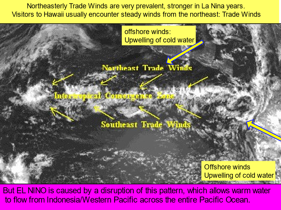
The sun’s heating of Earth results in heating of the land and ocean water, and subsequent development of afternoon thunderstorms and rain showers, which extends well across the oceans. We can see this structure on satellite images as a band of showers called the Inter-Tropical Convergence Zone, often “ITCZ” or “ITC,” seen in Figure 1 below.
As a result of solar heating of the water and land masses, the air above the thermal equator expands by convection of the surface heat, so a bubble of high pressure aloft develops over the thermal equator, and aloft, the air spreads away from this local high-pressure zone. This causes the pressure at the surface to fall, and the equatorial trough of lower surface pressure and weak winds forms. In days of sailing ships, sailors called this trough of low pressure “the doldrums.”
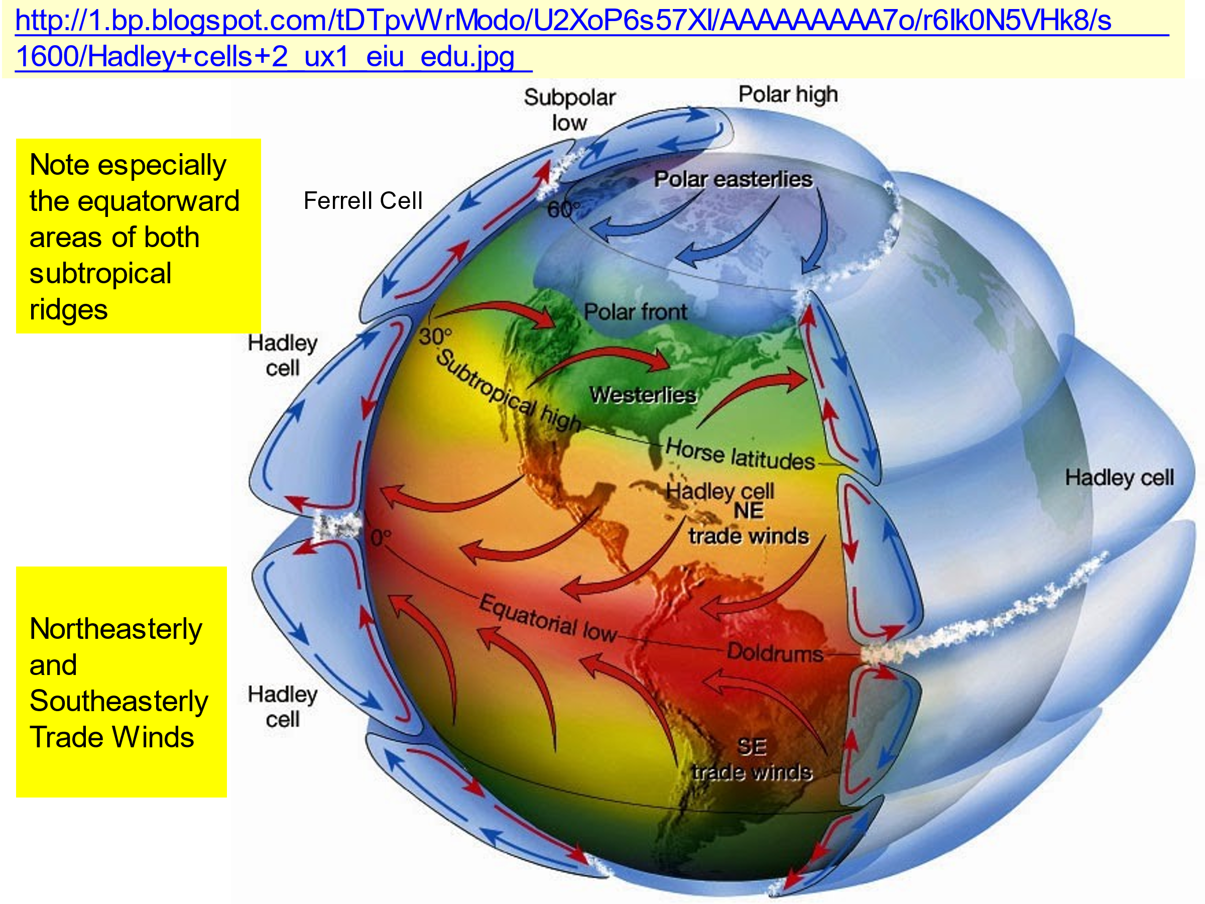
About 30 degrees of latitude north and south of the ITCZ, an area surface high pressure develops, characterized by descending air in a band around Earth. The meteorological name for this high-pressure feature is the “Subtropical Ridge,” but it has many other names, depending on the location of the populations affected: “Bermuda High,” “Bermuda-Azores High,” “the Sun Belt,” “Hawaiian High,” are some of the names. In the days of sailing ships these high-pressure areas were called the “Horse Latitudes.”
The Subtropical Ridge is most important to this topic because of the resulting air flow at the surface away from the center of this high-pressure cell. The equatorward components of this wind flow are the Trade Winds. Figure 1 below shows these features and the related cloud structures.
The How and The Why this occurs
Convection of heat in the rising air above the ITCZ expands that air, resulting in momentary high pressure above the ITCZ, but aloft there is divergence of that air. The wind flows away from this local high pressure, and as soon as this divergent flow aloft occurs, atmospheric mass is removed, and the atmospheric pressure at the surface falls, forming the equatorial trough, which is also called the doldrums, seen in Figure 2 below. The resulting vertical circulation pattern is from thermal equator to 30 degrees poleward from the thermal equator, where descent, subsiding air, occurs. This vertical circulation is the Hadley Cell, seen and labeled in Figure 2 below.
El Nino is one component of the complex family of phenomena formally known as El Nino-Southern Oscillation, ENSO. The names of the phases of ENSO are “El Nino”, “La Nina,” and “ENSO-neutral.” A good reference for diagrams showing these phases and their relation to the geography of the Pacific Basin is the e-book, “Who Turned on the Heat?” by Bob Tisdale, some of which are also in the presentation graphics associated with our June 2021 meeting of the CASF.
During La Nina and ENSO-neutral periods, the surface stress from the trade winds pushes the just-upwelled cold water towards the west, as indicated in Figure 1 above. The once-cold water is heated by the strong equatorial sun during its long (160 degrees of longitude) trip west, across the entire width of the Pacific Basin. As a result, the by now warmed water stacks up when it encounters the shallower water region of the Maritime Continent, the area near Indonesia. Another result of the piled-up water up near Indonesia: sea level is on average about half a meter higher in the Western Pacific than when it began its journey off the coasts of North and South America.
Constant replenishment of sun-warmed water in the Western Pacific causes the warm water to be stored in the waters below the surface. This “warm pool” in the Western Pacific is almost 300 meters deep, a tremendous reservoir of warm water that holds the heat because of the high specific heat of water.
La Nina and ENSO-neutral conditions can continue for from two to perhaps seven years, but eventually a disturbance interrupts this, and the dammed up hot water from the western Pacific is released, and it flows “downhill,” across the Pacific until it meets the west coasts of South and North America where it spreads poleward. This is the rush of warmed waters which replace the cold upwelling waters off South America, it clouds up and rains. This is strongest at the Northern Hemisphere winter solstice: El Nino arrives.
Video of the 1997-98 El Nino is on the CASF Web Site; watch it several times to get a sense of the speed of the water moving across the Pacific and the timing of the maximum extent of the warm waters, using the embedded date feature.
Why it rains and pours in southern California
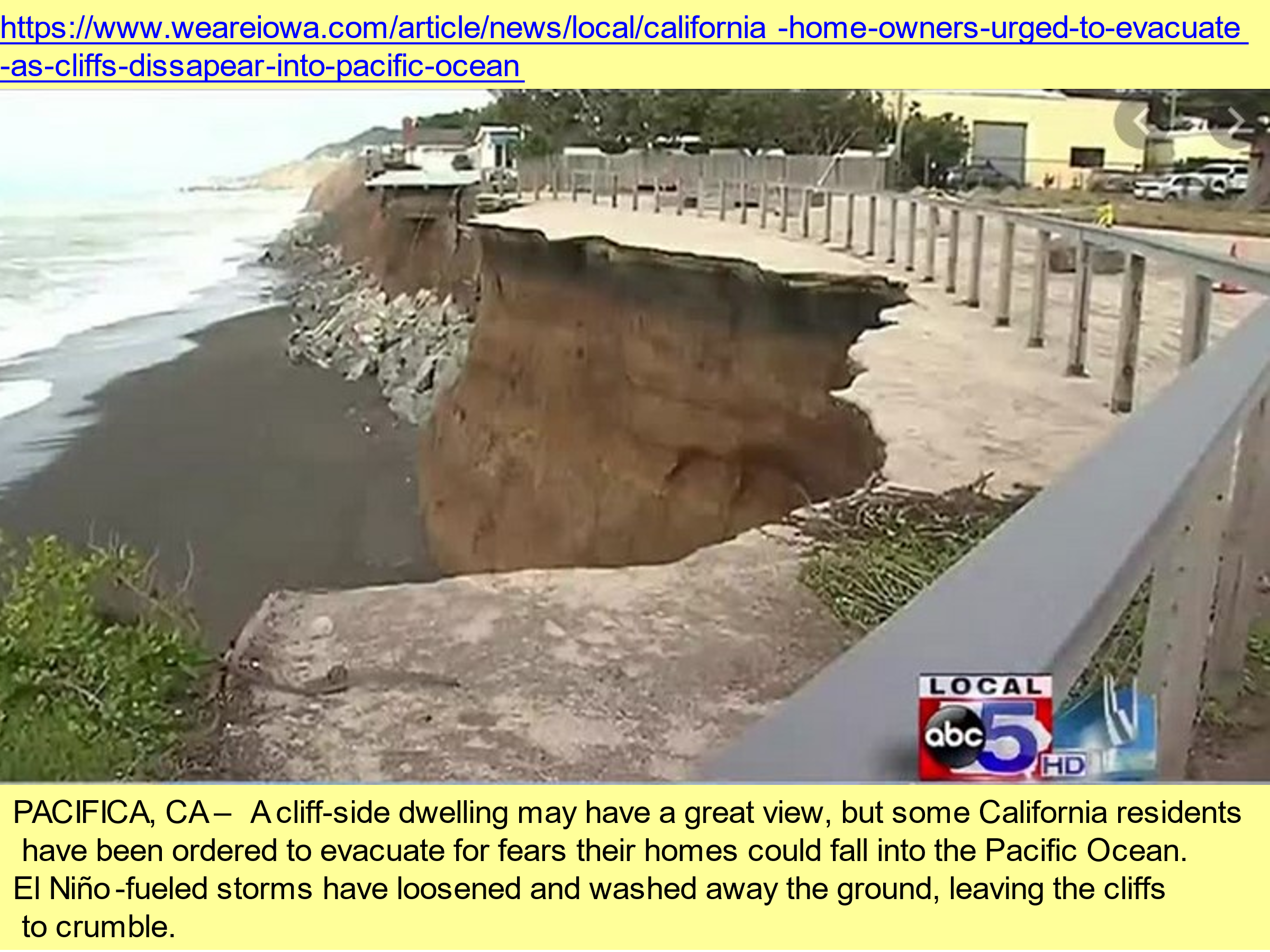
Because of the vast size of the Pacific Ocean, this sudden rush of the stored warm water from the reservoir in the Western Pacific at great speed across the Pacific causes a sometimes-dramatic spike in global tropospheric temperatures measured by NOAA’s satellites. The pool of warm water off the Pacific Coasts and the resulting surge of water vapor which evaporates into the atmosphere so close to the Pacific coastlines results in wet weather, the El-Nino-supercharged winter storms which move into the often sun-parched California.
An example of the TV coverage is in Figure 3 below.
Here in Southern New Mexico, the 1997-98 El Nino resulted with a huge increase in snowfall and snow cover; the nearby Organ Mountains and others were full of snow from just after Christmas 1997 well into March 1998.
A real spike in global warming!
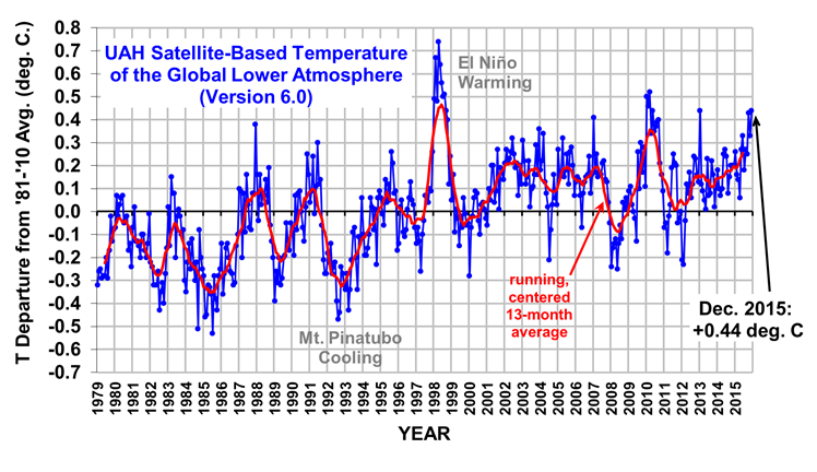
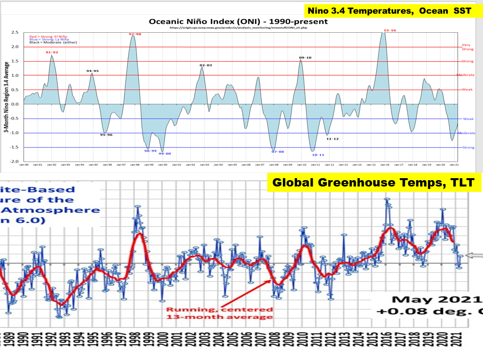
The University of Alabama-Huntsville (UAH) Earth Systems Science Team analyzes data from the microwave sounding unit (MSU) and the advanced microwave sounding unit (AMSU) sounders on NOAA’s satellites and creates time series of temperatures derived from these data. The methodology is constantly being improved both on the satellites and in the processing of the data by the University of Alabama Huntsville (UAH.) Figure 4 below is a textbook example of the temperature anomalies of the Temperature of the Lower Troposphere, the TLT, showing a time series ending in December 2015 which portrays both TLT cooling, a result of Mt Pinatubo’s eruption in 1991, and the TLT warming associated with the 1997-98 El Nino.
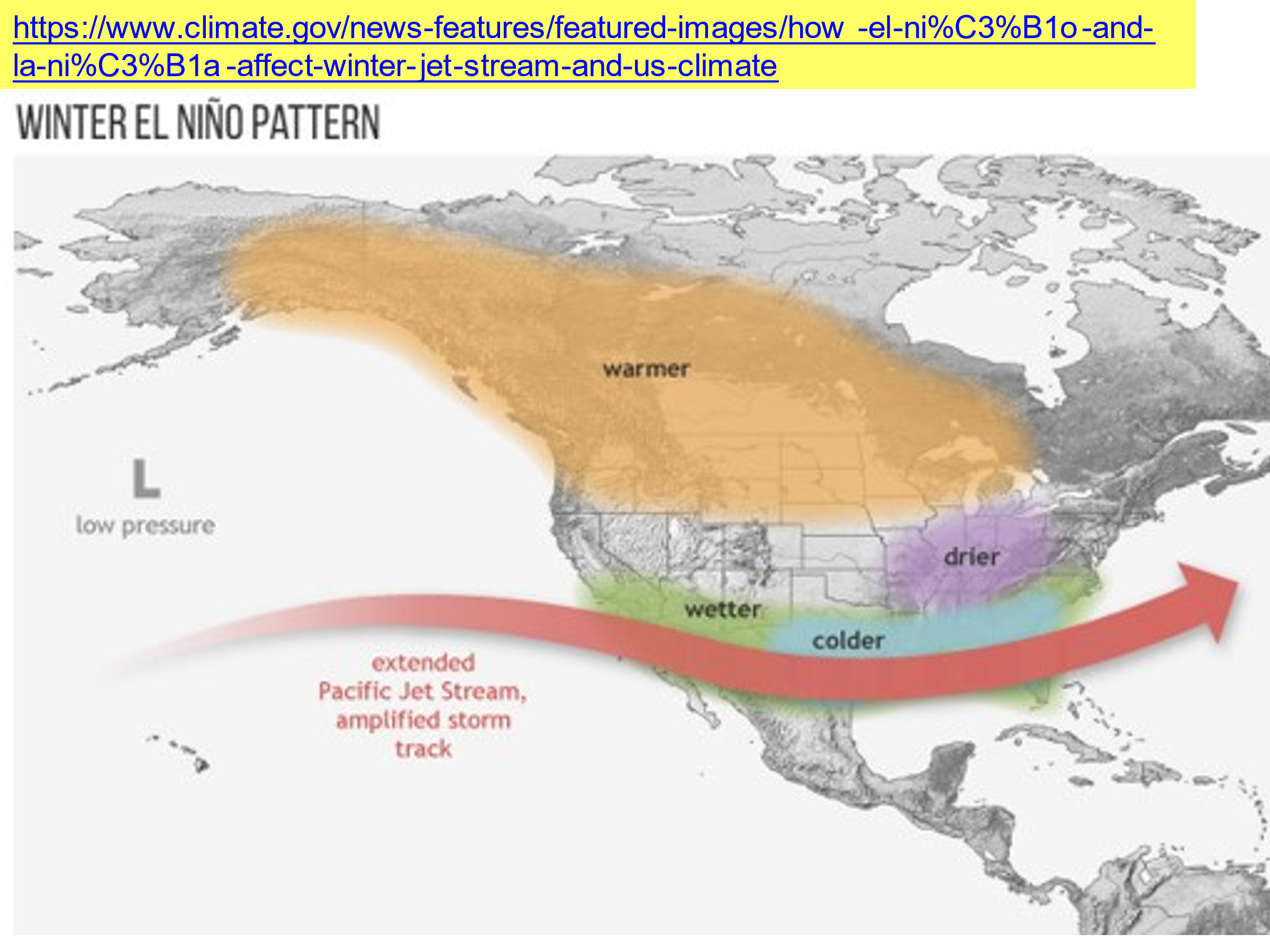
El Nino conditions bring significant weather effects globally. These effects in North America are displayed in Figure 5 below and cause wetter than average conditions from California on the west coast to Virginia and Florida on the east coast. Unseasonal warmth extends from much of Alaska to Michigan and the western Great Lakes. The movement of the warm water from being bottled up in the Western Pacific to splashing up against the Americas takes place rapidly; the sudden increase in seawater evaporation from offshore North America brings sometimes dramatic storminess. There are huge amounts of rainfall and snowfall in the western USA which bring numerous news stories about the sudden, often violent, rainstorms to the West, snowstorms to the Mountain West.
What’s with this Nino 3.4 Region?
There is another diagnostic which has been found to closely align with the changeover from La Nina or ENSO-neutral conditions to El Nino’s rainy snowy conditions along the US West Coast and into the Mountain West: sea surface temperatures. It arose from trial and error in finding the correct area. A hint in how it was found is shown below in Figure 6.
This diagnostic area is called “The Nino 3.4 region”. Looking at Figure 6, researchers first started with Nino 1 and Nino 2 areas close offshore the west coast of South America, then the Nino 3 area plotted in red, then the Nino 4 area plotted in blue. The best diagnostic has turned out to be the boxed area defined with the bold borders, the Nino 3.4 region, an area from 5 degrees north of the Equator to 5 degrees south, and from 120 degrees W to 170 degrees W.
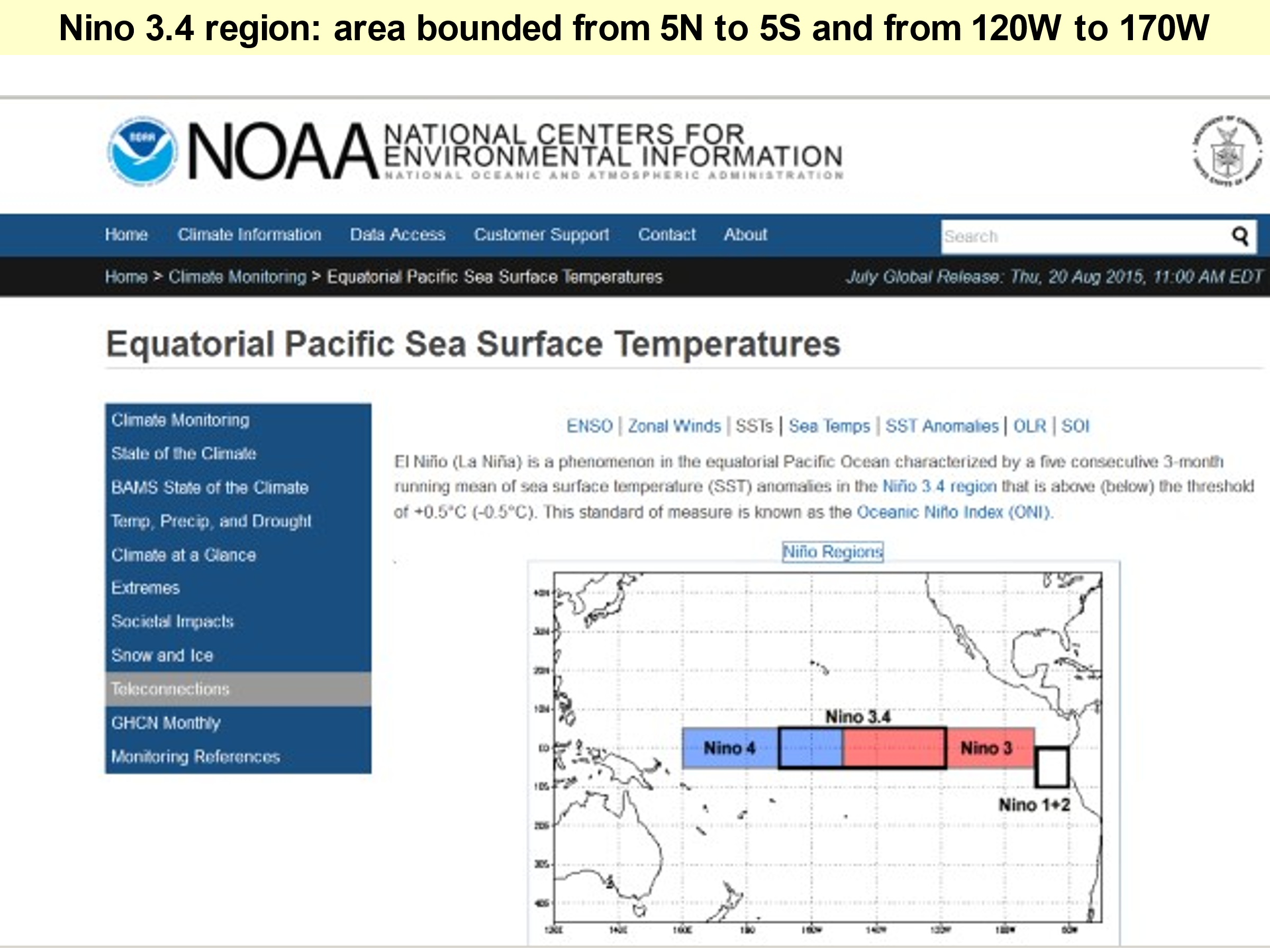
Figure 7 below is a plot of the Ocean Nino Index over a 30-year period, 1990-2021, from, Golden Gate Weather Services. Time, since Jan 1990 is plotted on the X-axis, and the temperature departure from the mean is the Y-axis, with warmer than average, plotted in red, or up, while Y-axis colder than average plotted in blue, and down. The data, plotted by Golden Gate Weather Services are used with permission from Jan Null.
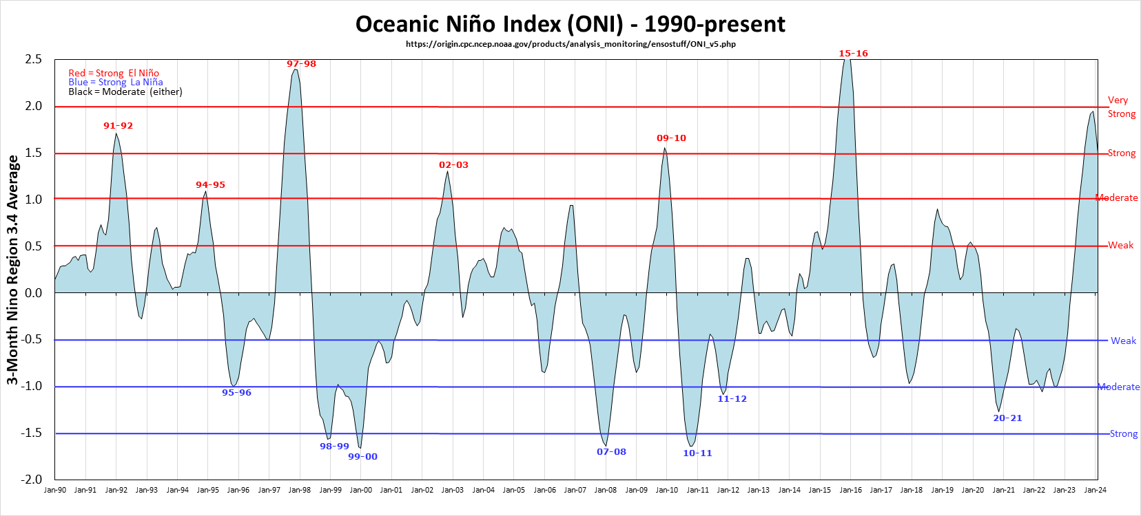
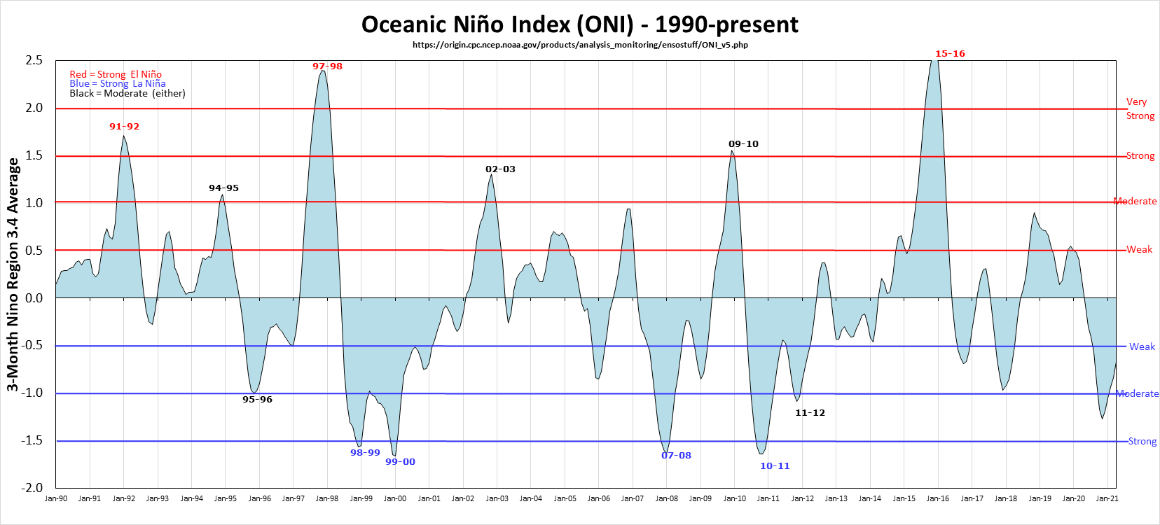
The two prominent temperature spikes are the 1997-98 El Nino and the 2015-16 El Nino, while the 2002-03 El Nino and the 2010-11 El Ninos are significantly weaker. The La Nina features are the shaded areas below the Zero line and are more numerous and stronger after the 1997-1998 El Nino was replaced by the 1998-1999 La Nina transition. Development of the 1998-99 La Nina is on the CASF Web Site.
A tale of two ENSO diagnostics
We have enough data now to understand the detailed diagnostics, temperatures for this beast we call El Nino or ENSO. These diagnostics are sea surface temperatures of the Nino 3.4 region, the ONI, and the temperature of the atmosphere’s “greenhouse,” the temperature of the lower troposphere, the TLT, measured by satellite. There is excellent correlation, one with the other, exemplified in Figure 8 below:
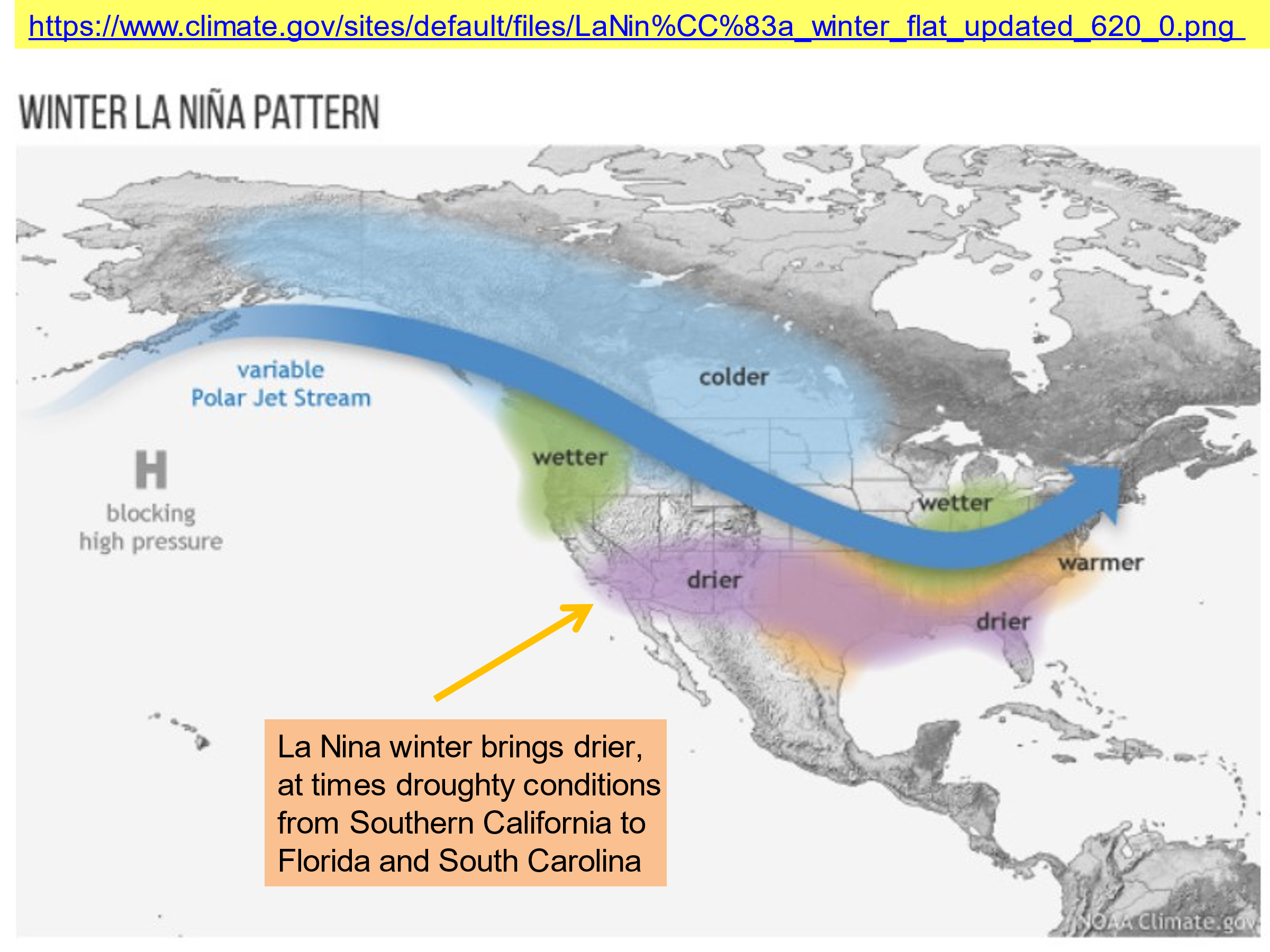
During many, if not most years, strong trade winds cause La Nina, less strong trade winds bring ENSO-neutral conditions. A diagnostic map showing the effects of La Nina conditions in North America is shown in Figure 9 below. An important feature of La Nina conditions is the extensive area of dry conditions from California and Arizona across the United States to South Carolina and Florida, and warmer conditions from eastern New Mexico across the Sun Belt states to Virginia. Frequently climate alarmists call the La Nina dry periods the results of “human-caused CO2-fueled global warming”, such as was the case in Greg Garfin’s “Climate Education” lecture and the Fourth National Climate Assessment.
In the USA, we are fortunate to have one of the better sources of climate information, and here in the West, the Western Regional Climate Center has records for thousands of sites, most of them the COOP sites, which are often treasure troves of data from rural stations. Some of the data goes back to the 1880s, but at best, there are only 130-140 years’ worth of data.
What about longer periods?
For longer terms we rely on “proxy” estimates, based on weather’s effects on processes in the natural world. The University of Arizona Tree Ring Laboratory is a World Class leader in proxies for temperature and precipitation based on careful examination of data from tree rings.
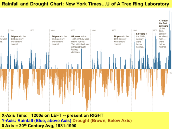
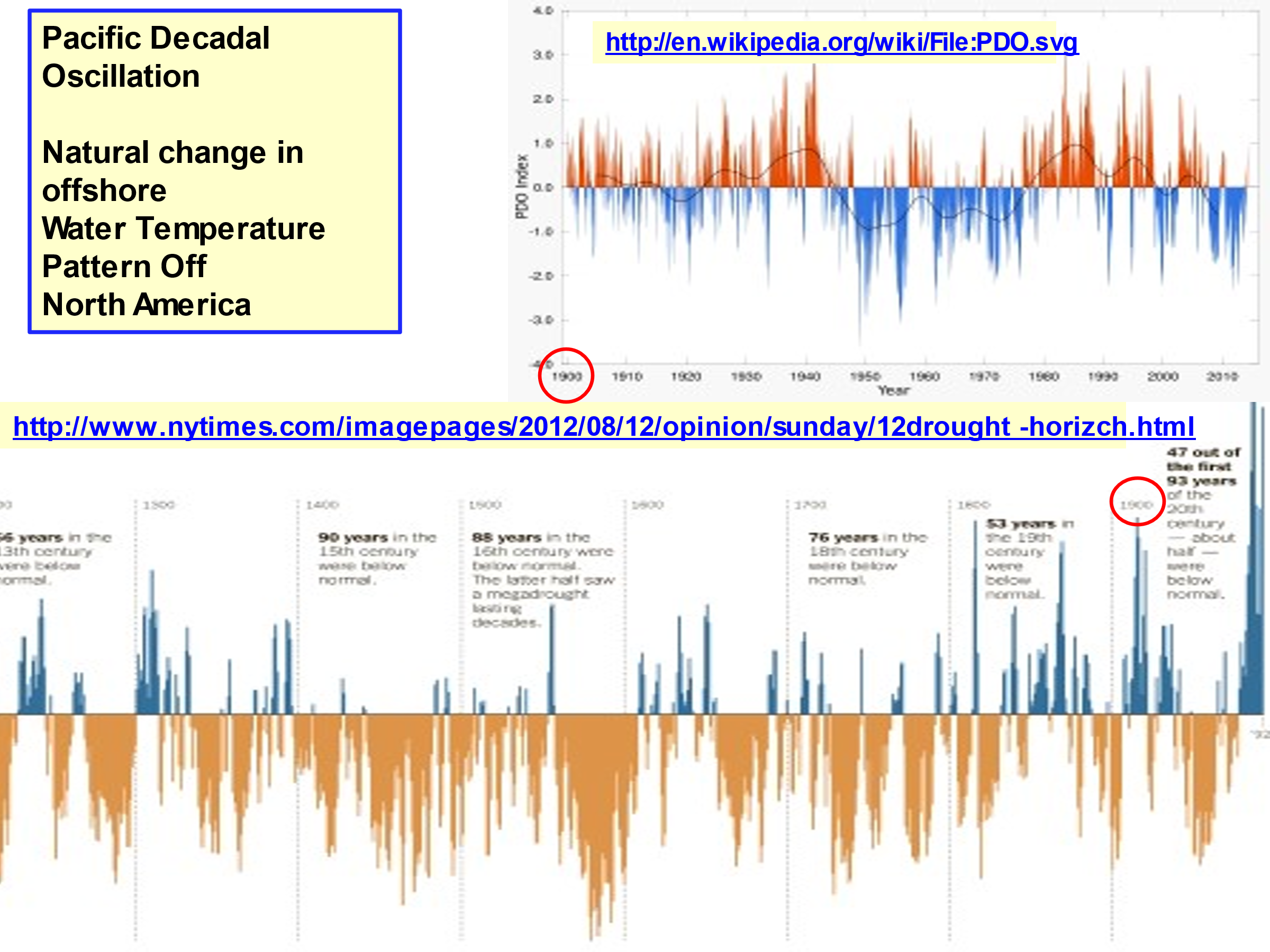
One such study was published in the New York Times, “The Longest Measure of Drought: 21 Centuries of Rainfall in New Mexico” a time series chart, the last eight centuries of which are shown in Figure 10 below. The chart uses a benchmark of the mean rainfall from 1931-1990. Years with greater than the benchmark mean are shown in blue, and years with less than the benchmark mean are the orange-brown areas below the benchmark. Based on this analysis, the wettest period of the last 2000 years was the last part of the 20th Century. The 20th Century displayed a “wet-dry-wet” periodicity, artifacts of the Pacific Decadal Oscillation, described later.
In this part of the country, colder is drier, a lot drier, as shown in the punishing droughts of the Little Ice Age, when the Spanish were forced to abandon their mission at Abo’, near present day Mountainair, New Mexico, because the crops which supported the mission and the indigenous people, failed for so many years in a row.
A “60-year” cycle: The Pacific Decadal Oscillation
Earlier we discussed the role of the Warm (El Nino) and Cold (La Nina) ocean currents in determining the rainfall and drought periods in the West and the Mountain West. There has been significant study of a 50 to 70-year periodicity of an ENSO-like climatic regime, the Pacific Decadal Oscillation, PDO for short.
The sequence of these phases over the past century plus follows: cool, 1890-1924, warm, 1925-1946, cool 1947-1976, warm 1977-1998, and cool since 1999. The reason for this quasi “60-year” oscillation are not clear, but the effects of the El Nino-like pattern have been dramatic, as revealed in the 20th century tree ring pattern shown in Figure 10 above and water levels in Elephant Butte Reservoir, largest lake in New Mexico plotted in Figure 1 from our 2018 post “Drought, Climate and Elephant Butte Reservoir Water Storage.”
Figure 11 below shows the latter part of New Mexico’s 2000-year rainfall and drought pattern revealed from the analysis by the Tree Ring Laboratory of the University of Arizona, bottom, and the Pacific Decadal Oscillation Index from the literature. The year 1990 has been circled in red to help understand the time series domains, which are vastly different. The point is to show the close relationship between the tree ring data and the PDO Index over the past century plus, showing the “60-year” periodicity of the PDO. The wet-dry-wet pattern from the tree ring data for New Mexico, the bottom plot, matches the warm-cold-warm PDO Index, the top plot.
Wrapping Up
Climate alarmists sometimes cite long term dry periods associated with La Nina and ENSO-neutral conditions, and the rapid change from dry and drought to wet stormy weather along the Pacific Coast of the USA as evidence of a human fingerprint on climate. The Fourth National Climate Assessment statement:
“Rising air and water temperatures and changes in precipitation are intensifying droughts, increasing heavy downpours, reducing snowpack….”
is flat wrong as it pertains to New Mexico.
It is not necessary to believe false CO2 theory and stories to understand the wild weather in the wild West; it is only necessary to read the literature and understand the ENSO-influenced climate we have here, naturally.