
By Robert Endlich
There are numerous stories in the media about “Declining Arctic Sea Ice Extent.” This post is the story of what I found when I started looking into the specifics cited in some of those stories.

With a background in geology and as an operational meteorologist with 30 years in research and development, at the outset I became suspicious when periods of record cited as ‘lines of evidence’ were well short of the characteristic 60-year time period of naturally occurring weather events which influence my locale, New Mexico. The 60-year weather cycles which dominate North America are the Atlantic Multidecadal Oscillation for temperatures, and the Pacific Decadal Oscillation for rainfall, especially in the Mountain West of the USA, more of which is described here.
Some of the loudest and shrillest cries of, “Declining Arctic Sea Ice Extent,” come from our own Government in the Fourth National Climate Assessment, NCA4. Some of the most disturbing cries come from the Executive Summary’s paragraph on Arctic Sea Ice Loss, particularly, this statement, “September sea ice extent has decreased between 10.7% and 15.9% per decade. (Very high confidence) …”
Shortly after this statement, the Executive Summary shows graphics of Arctic Sea Ice extent in 1984 and 2016, with this graphic; I added the title in yellow highlight.
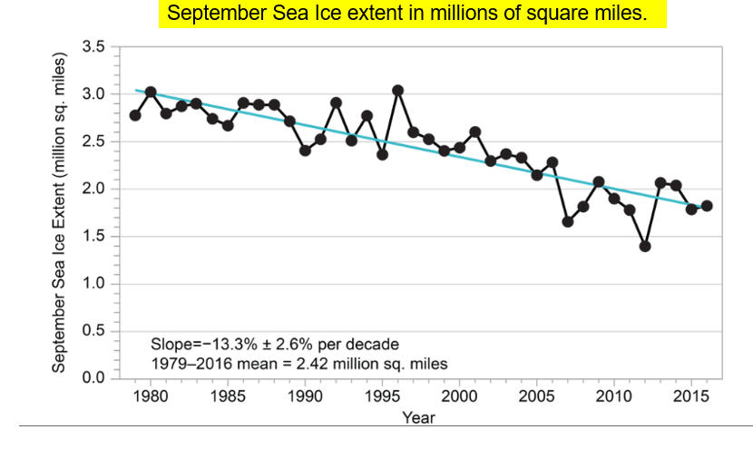
I was immediately curious as to why NCA4 chose this particular period and became suspicious that the choice was politically motivated deception, and not part of a desire to inform the readership.
In doing my research, I found several figures of merit pertaining to this subject, having centuries-long records which might provide context. The satellite era is short with respect to prominent weather and climate cycles such as the ~60-year periods of both the Atlantic Multidecadal Oscillation, often AMO, and the Pacific Decadal Oscillation, frequently PDO. Even with the dawn of satellite imagery, it was notoriously difficult to distinguish between snow and ocean ice, a task made more difficult with low sun angles or no sun at all for long periods of the year. So, accurate ice-snow discrimination did not occur reliably until the development and deployment of reliable multispectral detectors for satellite imagers.
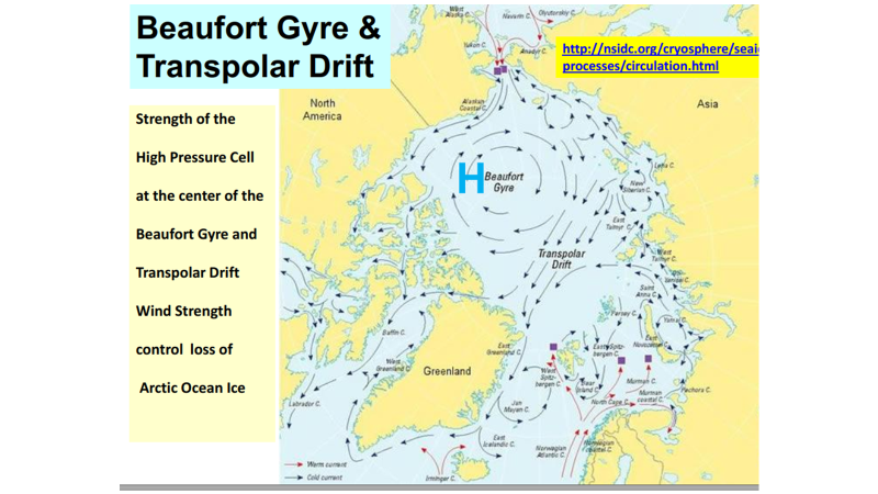
Antarctica is a continent at the South Pole. But, in the Arctic, the North Pole is surrounded by ocean. The ice is floating sea ice susceptible to wind drift, specifically, the strength of the Beaufort Gyre and Transpolar Drift. When strong winds are present, these winds can push floating Arctic sea ice into the Fram Strait between Greenland and Svalbard, into Gulf Stream-warmed waters, as you can see from the map below.
THOUSAND-YEAR BOND CYCLES DOMINATE NORTHERN HEMISPHERE TEMPERATURES
It is difficult to find the phrase “climate cycles” in the National Climate Assessment. The Thousand Year Bond Cycles which dominate Arctic ice core records, Alpine Tree Ring proxy temperatures and multi-proxy temperature reconstructions, such as those of Ljungqvist below are never mentioned in NCA4.

What other information having a longer time period might we use in comparison with the NCA4’s short 36-year period of record?
From WW2 we have the fascinating story of Glacier Girl, an almost-new P-38 which landed near the crest of the Greenland ice cap on 15 July 1942. A flight of US Army Air Corps aircraft encountered poor weather enroute to England during WW2 and the flight made an emergency landing. The entire group of pilots and aircrewmen escaped, but the aircraft were left on Greenland. Years later Glacier Girl and the other aircraft were located with ground-penetrating radar, and fifty years after the emergency landing, Glacier Girl was disassembled, extricated, and later restored to flight.
Glacier Girl was found under 268 ft of ice, which started as snow, and compressed into ice as the weight of subsequent snow accumulated. That works out to over 5 ft of ice per year, and at 3 ft of snow to 1 ft of ice, about 16 ft of snow per year. It also suggests the posited post-1950 anthropogenic “global warming” did not have much influence.
The NCA4 claim of the approximately 11-16% per decade decrease certainly does not match up with data from Torgny Vinje of the Norwegian Polar Institute, Oslo, Norway. Vinje analyzed records of sea captains’ logs from the Nordic Sea (not the Arctic Ocean, but close) ice extent which showed coverage of Nordic Sea ice has been decreasing at least since 1860, at an ever-decreasing rate. Examine the graphic below from Vinje, below; it displays climate cycles of various lengths and strengths. This graphic raises serious doubt on claims of rapidly-decreasing floating sea ice due to human CO2 production.
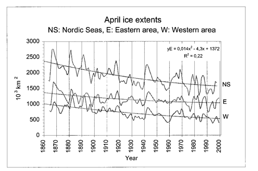
An even longer temporal record which gives an idea of what Arctic Ice history might have been is available from the National Park Service. Their graphic description of ice extent in Glacier Bay National Park is Figure 5 below. The 140-year graphic from the Norwegian Polar Institute records, Figure 4 above, and the 250-year record of ice extent in Glacier Bay, Figure 5 below, are significantly longer than the 36-year period of record NCA4 uses.

The ~250-year record of glacial ice extent at Glacier Bay National Park, Alaska shows that glacial ice there has been retreating since ~1760. When George Vancouver’s expedition mapped the mouth of Glacier Bay in 1794, Glacier Bay was mostly full of glacial ice. The map above shows significant ice loss in Glacier Bay has been ongoing since before 1760. This fact points, of course, towards long-term warming that has been occurring at least since 1760. Warming started before the Revolutionary War, a natural cycle which also could explain the long-term decline in Nordic Sea Ice noted in Vinje’s analysis of sea captains’ logs.
ARCTIC ICE FIGURES OF MERIT
The Danish Meteorological Institute, DMI, maintains an active world-class monitoring and forecasting capability for the Arctic. DMI’s Polar Portal home page, http://polarportal.dk/en/home/ is an excellent place to start, with tabs for Greenland and Sea Ice (and icebergs) providing daily updates. For our purposes, the Sea Ice Thickness and Volume tab, http://polarportal.dk/en/sea-ice-and-icebergs/sea-ice-thickness-and-volume/ , provides access to daily ice extent and color-coded thickness. The multiyear time series of daily Arctic Sea Ice Volume for the previous five years is a splendid source of information, examples below:


Here are the data for the past ten years, based on these data from DMI:
https://realclimatescience.com/2019/04/arctic-sea-ice-continues-to-grow-2/

The National Snow and Ice Data Center, NSIDC, generates a similar product, MASIE, Multi-sensor Analyzed Sea Ice Extent with results are similar to those of DMI.

The Danish Meteorological Institute also tracks Greenland’s surface mass balance every day, beginning each ice year on 1 September, extending to 31 August the following year. Since today is 30 May 2019, the current ice year started on 1 September 2018, and is still in progress.
Increasing atmospheric <CO2> is the purported source of the “declining Arctic Sea Ice” mentioned in NCA4’s Executive Summary. Let’s examine the past two years’ worth of DMI daily Surface Mass Balance data. We want to see if these data match up with NCA4’s claims of rapid Arctic ice melt over wide areas of the Arctic Ocean. Such declines might be expected with increasing amounts of well-mixed atmospheric carbon dioxide

After examining the DMI Surface Mass Balance for the last couple of ice years, 2017 and 2018, mass of the ice accumulation in Greenland is well above the 1981-2018 mean. This suggests that increasing atmospheric <CO2> is not responsible for rapid ice loss. It appears as if natural processes are in play in Arctic ice mass accumulation in Greenland.
ANALYSIS: WHY DID NCA4 CHOOSE THE TIME PERIOD 1980-2016?
Suspicious of a very short averaging time of just 36 years, I found Figure 11’s graph of Arctic and Global temperature, a 100-year time series, from the University of Alaska, Fairbanks. The 60-year weather and climate cycle mentioned in the beginning paragraphs is also seen in the Arctic! Arctic temperatures were higher in the 1940 peak than the year 2000 peak, another failure of Carbon Dioxide Theory.

Examining Figure 11 gives a strong indication why the authors of NCA4 chose 1980 as the starting point for their 36-year period of analysis—it is during a period of strong temperature increases.
In the 28 August 1981 Edition of SCIENCE, NASA’s James Hansen was first author of, “Climate Impact of Increasing Carbon Dioxide,” a now hard-to-find report which on our web site, https://casf.me/wp-content/uploads/2019/01/PDF_Climate-Impact-of-Increasing-Atmospheric-Carbon-Dioxide_Science__28_August_1981_Hansen81_CO2_Impact.pdf
One of the figures from that report is particularly noteworthy, and is below, Figure 12.

So, another reason the NCA4 authors chose to start their period of Arctic Ice decline in 1980 is because temperatures had fallen significantly for at least 25 years from their heights of the late 1930s and 1940, and started to rise again.
The IPCC’s First Assessment Report, sometimes FAR, was published in 1990. One of the graphs from that report is Figure 13 below. It provides more insight as to why the NCA4 authors chose 1980 as the starting point for their Arctic Ice decrease calculation.

We have seen cherry-picking specific dates to achieve political objectives several times before. The most notorious example is from Ben Santer of Lawrence Livermore National Laboratory in 1996, shown in Figure 14 below:

With the examination of the data from Professor Ole Humlum shown in Figure 15 below, we can see clearly another reason for NCA4’S choice of the 1980-2016 period to characterize Arctic Ice declines.

Far from the whopping declines of 11-16% per decade, Humlum and Polyakov see an “insignificant” decrese of about -0.5 to -0.7% per decade when an entire century-long time series is used for the analysis period.
CONCLUSIONS
We conclude that our skepticism of the huge Arctic Ice extent declines, almost 11 to 16% per decade, is well founded. NCA4’s numbers are politically-motivated to engender a sense of fear and dread with the readership and to provide ammunition for numerous “Climate Catastrophe” scare stories in the media. Rather than the precipitous declines of NCA4’s claims, a century-long record shows seemingly insignificant declines of -0.5 to -0.7 per cent per decade. And, rather than finding human-caused CO2-fueled decreases, these century-long data are right in line with the thousand-year Bond Cycles which dominate Northern Hemisphere climate in records from Europe to Greenland.