
Robert W. Endlich

The summer of 2019 was hot in Europe, but the claims of new extreme record maximum temperatures, of sled dogs in Greenland mushing through never-heard-of-before water on the ice sheet, and of direct links to human-caused CO2-fueled use of inexpensive energy are wrong, incorrect, and without due diligence by the writers of such drivel. Herein is a view you didn’t see in the Main-Stream Media.
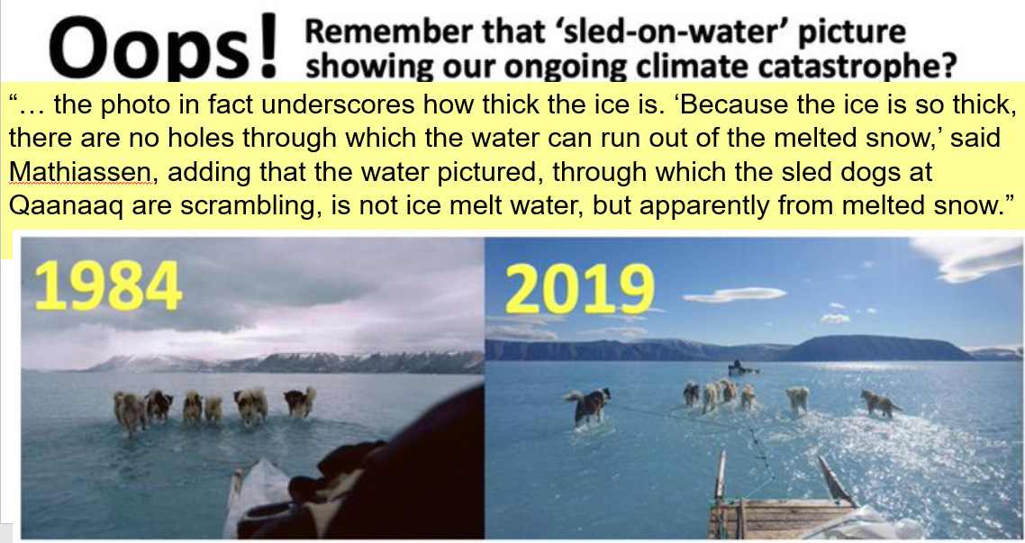
The CNN Photo
This post starts with a CNN story with this breathless paragraph,
“The incredible photo he took, of sled dogs ankle deep in a wide expanse of light blue water, quickly went viral, destined to join pictures of starving polar bears, shrunken glaciers, stranded walruses and lakes turned bone dry in the pantheon of evidence of our ongoing climate catastrophe.”
Climate catastrophe? The alarmists quickly sent this around as evidence, proof positive.
It took just a few days later for the rest of the story to come out; this is not an especially rare event for June. The photo was taken near Qaanaaq, about 60 miles north of US Air Base at Thule, Greenland, and at over 77N latitude, this area enters “midnight sun” on 15 April and does not exit midnight sun conditions until 20 August. So, when the photo was taken on 13 June, the area had been in 24 hours of sunlight for almost two months! Direct sunlight might be expected to melt the snow on the sea ice surface, and indeed it did; turns out this is not a rare event at all as the story at the link above tells, and which Figure 1 below demonstrates.
What good are standards if they are not observed or enforced?
The story soon shifts to Europe before returning to Greenland, but first, a brief review of the international standards on the exposure of thermometers, standards which enable a key element in science to be exploited, especially in operational meteorology, replication of results. It turns out it is not too difficult to stick a thermometer outside to get a hot temperature reading.
During the day when the sun is shining, the surface, including pavement, asphalt, bare dirt and flagstone walkways get very hot, as I learned as a barefoot kid walking back to the car after a day at the beach. You soon learn to avoid such by walking on white sand and the white crosswalk marks instead of black asphalt. To get repeatable results measuring air temperatures, the instrument cannot be close to the ground. It also must follow the standards below.
Another principle in getting replicable results for air temperature is to keep sunlight from falling directly on and heating up the thermometer itself. So, a screened thermometer, screened from direct solar radiation, was implemented to screen liquid in-glass-thermometers. Here is an example of such a Stevenson Screen but it is mounted incorrectly since the sun is shining on the side with the door. The sun should never be permitted or allowed to shine on the instruments inside. “Wikipedia, we have a problem.”
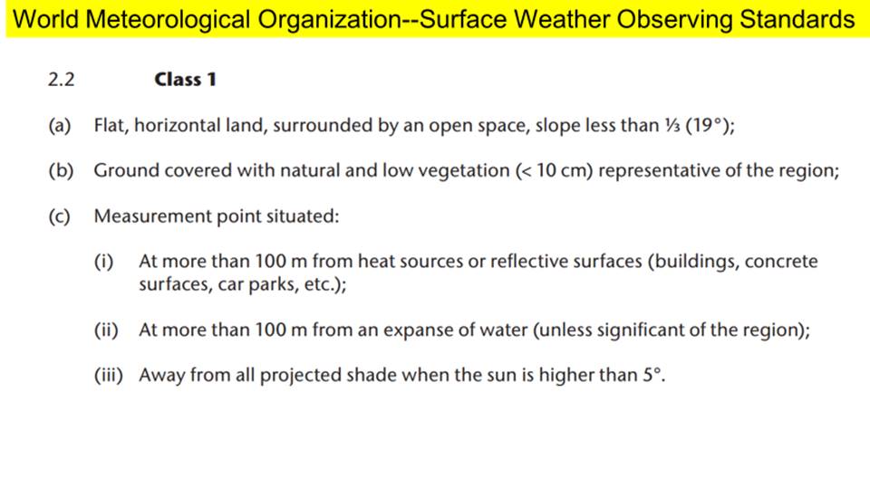
You can also get way too hot air temperature indications if your thermometer is close to asphalt, building walls, rock cliff faces, air conditioner exhaust, metal equipment shelters, the list goes on, so the World Meteorological Organization publishes standards for meteorological instrument exposure.
The most reliable observations for climatological statistics come from “Class One” stations, the most important elements of which are:
Who enforces the standards? The National Offices for Meteorology in the member countries are supposed to.
Likely NO ONE does, and in the USA the situation with suspected poor thermometer exposure got so bad that Anthony Watts and Roger Pielke crowd-sourced an effort to audit US stations.
The fruit of their results is on line at www.surfacestations.org and a downloadable report is at https://wattsupwiththat.files.wordpress.com/2009/05/surfacestationsreport_spring09.pdf
The poor results for the USA were noticed. The GAO opened this finding: “Climate Monitoring: NOAA Can Improve Management of the U.S. Historical Climatology Network GAO-11-800: Published: Aug 31, 2011. Publicly Released: Sep 30, 2011.”
As the story continues, we’ll find that the German Weather Service, DWD, and the UK Met Office clearly know that the standards are not being met, nonetheless they happily join the chorus of “climate catastrophe” and allow the entry of extreme high temperature records for sites within their purview which clearly do NOT meet Class One standards of the World Meteorological Organization.
Unfortunately, it seems as if the WMO itself is in on the con—it is the host organization for the Intergovernmental Panel on Climate Change.
We Knew Ahead of Time Europe was going to have the 2019 Heat Wave
For Operational Meteorologists, forecasting a coming heat wave or cold wave is relatively easy, a lot easier than forecasting the exact track of a hurricane days in advance, for instance. The 2019 heat wave in June was such an event, because it followed the development of an “Omega Pattern”; when it gets more pronounced, we call it an “Omega Block” which can last for a week or so and the 2019 event in Europe was fully expected a week prior to its onset. This one was especially brutal because of onset at the summer solstice, those days of the year when the days are longest and the solar heating is the maximum possible. This one, as in many previous, was enhanced by proximity of Europe to north Africa, so the southerly winds on the front edge of the Omega Pattern brought “the giant Saharan air plume.”
I found this story from the Sun in the UK had the right tone and substance with this quote, “Meteorologists say hot air drawn in from northern Africa is responsible for the heatwave, caused by high pressure over central Europe and a storm stalling over the Atlantic.”
The “storm stalling in the Atlantic” is an important component of the development of the Omega Block I described above, so this paper got it right.
Nonetheless the AP was among the crowd, “Scientists link Europe heat wave to man-made global warming,” despite the fact that this was a well-anticipated Omega Pattern exactly at the time of year that the sun’s influence would be the strongest possible for the entire year, and the knowledge that what’s called in Europe a Sahara Air Layer weather event was known and advertised to the public well before the onset.
To be clear, it was a weather event.
I will not get into the new record for France proclaimed by Meteo France, the national weather service, because there has been confusion as to exactly which thermometer in Gallargues-Le-Montueuex set the 28 Jun 2019 record and no photo of that exact site has been made available. The purported new records in Germany and England, which follow the present section on France do have photos of the specific sites involved.
Dr Roy Spencer had these comments:
“ Record High Temperatures in France: 3 Facts the Media Don’t Tell You:
1. Record High Temperatures Occur Even Without Global Warming
2. Summer Heat Waves are Weather-Related, and Unusual Cold is Usually Nearby
3. Most Thermometer Measurements Have Been Spuriously Warmed by the Urban Heat Island Effect”
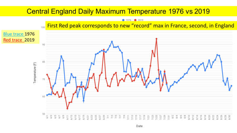
The strong winds from the south, the Sahara Air Layer, and especially the growth of Paris over the past 60 years led Tony Heller to say,
“On 25 July 2019, Paris Le Bourget Airport reached 106F, one degree warmer than the 1947 peak. This is not surprising because the wind was blowing from the south across the massive Urban Heat Island of Paris.”
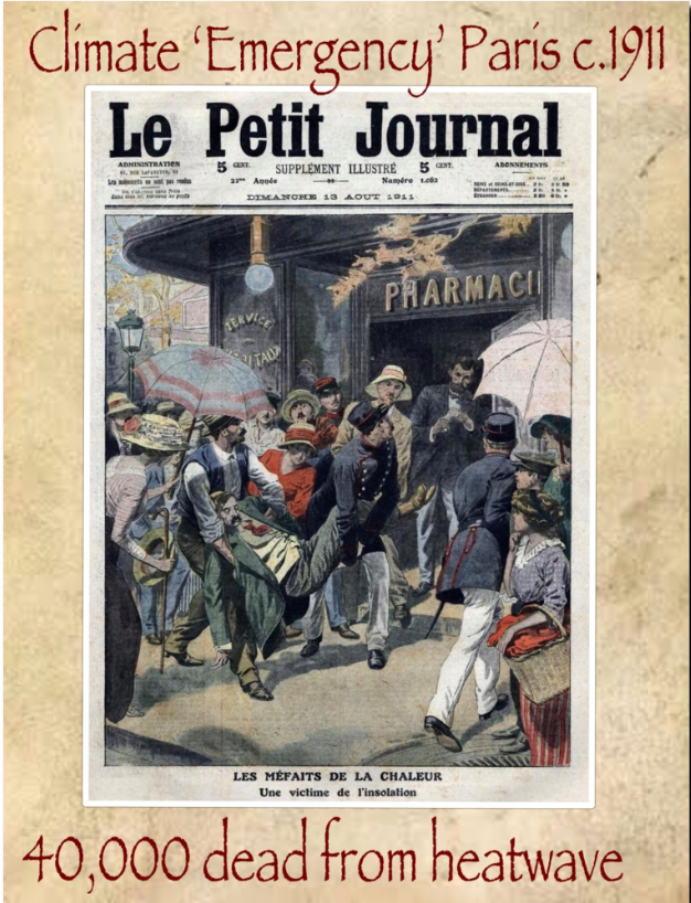
The 1911 heat wave in Paris claimed over 40,000 dead, mostly babies, and many in Paris had no water. La Parisien spoke of
“victims mowed by the heat and its consequences,” and “the mortal enemy is diarrhea, which is ravaging all across France.”
On the ground in the North German Plain military Avenue of Approach
I was fortunate to spend over 21 years as a Weather Officer in the US Air Force. My first trip to Europe was to arrange and oversee a US meteorological ground station at Meppen, Germany. During this assignment I was on flight status for the USAF C-130A Optical Physics Flying Laboratory. Our crew participated as part of the US component of a NATO project, OPAQUE, Optical Properties of Atmospheric Quantities in Europe. These duties involved operating equipment in the aircraft which we flew from the German Air Base at Wunstorf and profiled the atmospheric properties directly over the Meppen ground station. I also participated in flights from RAF Mildenhall during OPAQUE.
These experiences gave me direct on-the-ground experience very close to the stations for which record high surface temperatures were claimed in 2019 by the German Weather Service, DWD, and UK Met Office.

On the North German Plain in this area, close to the border with the Netherlands, the weather on the afternoon of 25 July 2019 was similar to the past days, a string of clear or nearly clear skies with light winds. On the ground, this area is drained by the Ems River (sounds like “Ames”) and the area is called Emsland.
On the afternoon of 25 July, the DWD station in Lingen recorded 41.5C, which is now called the new extreme maximum temperature for Germany. It is a very short distance, 25 km or only 15 miles, north from Lingen to Meppen, where I worked on the US surface measurements for OPAQUE in 1975 and 1976.
When the data came in, it was 3C or 5F hotter in Lingen than nearby Meppen. Since there were no nearby thunderstorms, cold fronts, or areas of disturbed weather that day, and the area is very flat, the maximum temperatures should have been close to each other.
It was only a matter of hours later that the DWD declared the new extreme maximum temperature for all of Germany, and only a short while after that that meteorologists familiar with the area cried foul because of non-compliance with WMO surface observation standards, with one blogger living nearby using the terms “cheated” and “lousy station siting.”
Soon the Twitter feed # Lingen had stories of the Lingen station and a graph showing an upward trend in Lingen’s surface temperatures compared with nearby reporting stations. Damning, at least to me, were the photos displaying the surface observing instruments in conditions far from Class One WMO standards.

The Lingen DWD site is cluttered with equipment shelters, heat sources with the sun shining directly on their west facing sides as seen in Figure 5. The thermometer is only a foot or less away from the 5-ft hedge which itself is only a few feet from the 45-ft tree line on the east side of the site. Also, the site sits in a prominent bowl, the steep west side of which is marked by the stairway and hand railings for walkways leading to the DWD office and observatory. The observatory-office is marked with the vertical antenna near the right side of the photo. The presence of the 5 ft hedge and the 45 ft tree line on the east side (left side Fig 5) of the site restrict the free flow of air to ventilate the thermometer. Figure 5 shows the sun reflecting off the hedge and the tree line, which would tend to heat the thermometer and its mount. The site is clearly not in compliance with WMO Class One measurement standards which require a flat open space, slope less than 19 degrees, and the ground covered with natural and low vegetation no higher than 10 cm or 4 inches.
On the same day in England, Cambridge reported another extreme maximum at the Cambridge University Botanic Garden.
As mentioned above, my first times in Europe were for Project OPAQUE in 1975 and 1976. We flew the C-130A Flying Laboratory out of RAF Mildenhall during our flights over the UK ground station. When the aircraft was down for maintenance, I was able to visit nearby (19 miles away) Cambridge. I re-visited Mildenhall and Cambridge in 2013.
The allegedly highest-ever recorded temperature in England occurred at the Cambridge University Botanic Garden. The extreme maximum temperature, 38.7C, was reported for the afternoon of 25 July 2019. The BBC report provided pictures of the Stevenson Screen at the Botanic Garden, and once again it is clear that the site does not meet the WMO Class One observing standards for surface temperatures, more about this below.
In the Cruces Atmospheric Sciences Forum, we are quite aware of another phenomenon which can lead to unreliably hot surface temperatures, the Urban Heat Island effect, sometimes UHI. We have made observations of, and posted the results of, the Urban Heat Island effect in Las Cruces by making range-quality measurements of the UHI during traverses of the city.
In Cambridge, another more rural Met Office observing site, is the National Institute of Agricultural Botany, NIAB, so an obvious first step was to examine the data to see if the NIAB site was warmer or cooler than the Cambridge University Botanic Garden. The NIAB’s maximum temperature on 25 July was 38.1C, compared with the Botanic Garden’s 38.7, a clear indication that the Botanic Garden seems affected by the Cambridge urban heat island.
The BBC image of the Stevenson Screen shows why this supposed new record should be rejected. It clearly shows the problems with the observing side and its non-compliance with the WMO Class One standards.

Here are the problems with this site: The thermometer and screen obviously are not in a clear open space. There are trees and huge buildings well within 100 meters which are well over the 4-inch height limit specified for a Class One observing site. The bare dirt in the mid-field of the photo clearly has different thermal properties from the grassy area of the foreground which makes the site non-representative. Bare dirt gets a lot hotter than grass-covered surfaces. Plus, Cambridge University and the City of Cambridge are growing, making the Urban Heat Island-contamination worse.
[There is a brief discussion on the Urban Heat Island and the problems of getting a long enough temperature record to avoid non-representative effects of 60-year climate cycles here]
My spring 1976 OPAQUE deployment was at the beginning of the hot 1976 summer in Europe, especially the UK.
“The long hot summer of 1976 which eventually ended in September of that year, was the culmination of a 16-week dry spell – the longest recorded over England and Wales since 1727,” UK Met office quote.
To give a flavor for the knowledge of “experts” quoted in the media, the BBC report quotes Cambridge University Botanic Garden director Beverley Glover:
“However, we can’t help but feel dismay at the high temperature recorded and the implication that our local climate is getting hotter, with inevitable consequences for the plants and animals around us.”
If you look at the data you see that this was a one-day weather event; the summer of 1976 was a lot hotter and occurred during the 1970s ice age scare.
Is a committee approach better? Quite possibly so.
The 2019 alleged extreme maximum temperatures were proclaimed within hours by the national weather services in Germany, France and the UK.
Within the USA there is a National Climate Extremes Committee (NCEC) and State Climate Extremes Committees which are called upon in the event a weather event seems to possibly have tied or broken an extant record. Experts are brought together to bring to bear expertise from National Centers for Environmental Information (NCEI) and additional representatives from the National Weather Service’s (NWS) “Analyze, Forecast and Support Office” and a designated representative from the American Association of State Climatologists (AASC). Mature people with expertise consider evidence.
It seems to me that the USA might have a better idea than these Europeans who have within hours proclaimed new extreme maximum temperatures even though it is blazingly apparent that no one is enforcing the standards promulgated by the World Meteorological Organization at the very sites where these “extreme” temperatures are alleged to have occurred.
Such is the state of critical thought within this science, my science, and further evidence that this is about politics, not about science.
Towards the end of the summer, more Alarmist false cries about Greenland
Near the top of this post, I mentioned we’d return to the subject of Greenland.
On 8 August 2019 a Washington Post Story lead with,
“Greenland is on track to lose most ice on record this year and has already shed 250 million tons.”
The subhead was,
“Arctic sea ice is also at a record low as warmer than average summer takes its toll.”
The Danish Meteorological Institute has world-renowned experts who report on Greenland’s daily “surface mass balance” and “accumulated surface mass balance” as the season develops. Starting at DMI’s Polar Portal English language version, “Monitoring Ice and Climate in the Arctic.” The Greenland > Surface Conditions Tab brings up a map and the bottom has a Surface Mass Balance graph.
Click the “Large Version of Latest Graph;” the following link and image appear:
www.polarportal.dk/fileadmin/polarportal/surface/SMB_curves_LA_EN_20190821.png
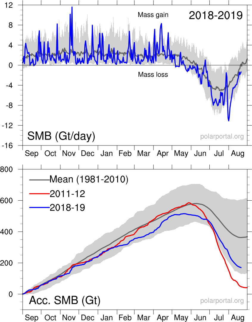
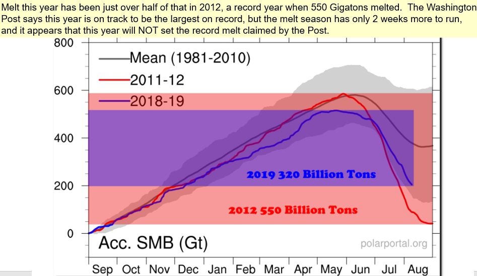
The blue curve at the top of the graph shows the current season’s surface mass balance measured in gigatons (1 Gt is 1 billion tons and corresponds to 1 cubic kilometer of water) on a day-by-day basis. There was a snowstorm on 18 November which dumped 10 Gt snow, and another snowstorm on 20 November which dumped an additional 12 Gt.
The light grey area in the top graph shows the range of accumulation over the 30-year mean 1981-2010, but after 1 June you see the melt season.
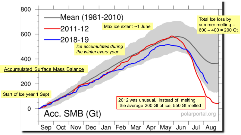
The bottom of the chart shows the Accumulated Mass Balance for three periods, the red curve is the very warm year 2011-12, the bright blue line is the current year which at this writing, 21 Aug 2019, had only 10 days (of mostly melt) to go for the balance of the ice year.
The dark gray curve traces the mean value of ice accumulation from the period 1981-2010.
The light gray area on the bottom shows the range of accumulated mass over the 1981-2010 period.
That 8 August 2019 a Washington Post Story subhead said,
“Arctic sea ice is also at a record low as warmer than average summer takes its toll.”
The Polar Portal home page also has a Sea Ice and Icebergs tab with a selection choice of Sea Ice Extent and from that page the ability to select the Large Version of Graph, seen below:

Plotted MASIE data from the US National Snow Ice Data Center over the time domain of the MASIE data also do not show Arctic Sea “at a record low.”
Heat Wave Stories have been written in Europe for over a Thousand Years.
Tony Heller has collected stories from books and newspapers from sources in Australia and the United States having 1500 years of Heatwaves , stories that show journalists have been writing about hot weather in Europe for over 1000 years. He shows and I document many which describe extreme heat and extreme weather effects felt during heatwaves of the past. During the latter portion of the Medieval Warm Period, Gaillard’s Medical Journal reported a heat wave in France so severe, “In 1303 and 1304 the Rhine, Loire, and Seine ran dry.” There are more here.
What have we learned?
GREENLAND:
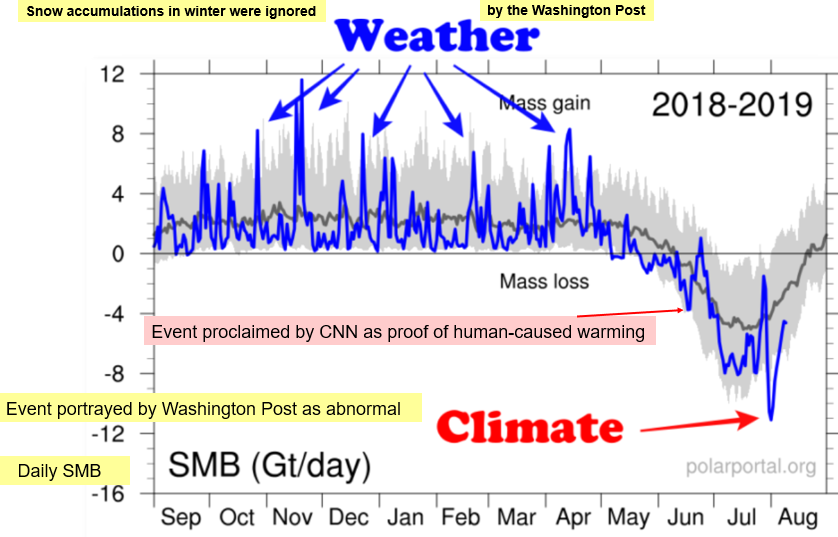
June 2019’s melting in Greenland, decried as climate catastrophe by CNN, followed past such events in June, some of which occurred in the 1800s. The Washington Post claims of Greenland being
“on track to lose most ice on record”
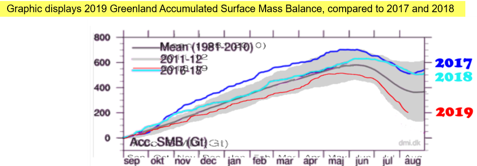
are belied by the data posted daily at the Danish Meteorological Institute’s Polar Portal, and studiously ignore huge ice accumulations in 2017 and 2018.
FRANCE:
The heat in France was forecast well in advance when an Omega Block developed at the Summer Solstice. Meteorologist reports indicate the heat came from strong southerly flow from Saharan Africa.
GERMANY:
The new record in Lingen, Germany was caused by clear weather and a bowl-shaped observing area cluttered with equipment shelters and a 45-foot tree line on the east side of the bowl. Reflected sunlight, trapped heat, and obstructed wind flow contributed to the observed phenomenon. Germany’s DWD Lingen observing site clearly fails WMO standards
ENGLAND:
The new record at the Cambridge University Botanic Garden is related to proximity of the recently constructed (2011) Sainsbury Laboratory and (2004) Plant Growth Facility and the presence of bare ground near the instrument shelter, all in violation of WMO Class One observing standards. Farmers and meteorologists know that bare dirt gets a lot hotter than grassy areas.
The alleged new extreme maximum was a one-day weather event. According to the UK’s Met Office, July 2019 was an unremarkable 45th warmest since records began in 1660.
The caterwauling from the Main-Stream Media and claims that 2019’s hot summer being part of human-caused CO2-fueled global warming are not true. Analysis of the claims and events reveals these were simply hot weather events in a warm summer; claims of new extremes are far-fetched and disappear under scrutiny.