
Robert W. Endlich
We have posted on this forum two recent essays by Richard Lindzen, the first, The Imaginary Climate Crisis – How can we Change the Message? from Clintel, and the second, An Assessment of the Conventional Global Warming Narrative, originally from London’s Global Warming Policy Foundation. I presented my analysis of the high points of Lindzen’s essays, along with some comments to bring these topics home, especially to those
of us in southern New Mexico, and also, from the world of operational meteorology.
Here is a small, but hopefully representative, sample of some of Lindzen’s most important thoughts, and some comments.
Lindzen properly says:
“…the whole narrative is pretty absurd.”
and in his writing, he goes on to provide the data and his reasoning for why he thinks the global warming narrative is not based in fact.
In the following sections, I will present some of his comments regarding temperatures, the non-precariousness of the balance of energy, and several other topics. I will also provide some of my thoughts on what Lindzen says.
WIDE VARIATIONS IN TEMPERATURES
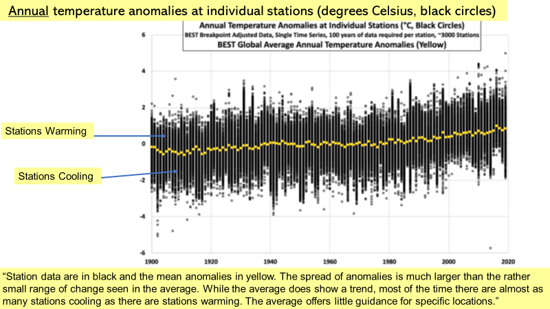
Lindzen analyzed 120 years of temperature data from the BEST compilation of 3000 (!) weather stations, each station having at least 100 years of data.For each year, Lindzen plotted each station’s temperature anomalies on the Y-Axis. In separate plots, each station’s annual and seasonal mean anomaly was plotted as a black circle with that value in Degrees C above or below the X-Axis, which defines the 0C temperature anomaly value.
Lindzen’s plots were made available from data from the CO2 Coalition; I used them in the presentation graphics as Slides 11 and 12 (annual) and Slides 13 and 14 (seasonal) data.
There were so many station plots for each year that the accumulated black circles appear as solid black vertical lines, one vertical set of plots for each year, 1900-2020. As the departure from the mean increased, the number of circles decreased so that the density of the apparent “black lines” decreased, and the high and low extreme values appear as greyish-black circles. The mean of each year’s anomalies is plotted in yellow.
These words become clear in Figure 1 below, annual temperature anomalies from individual stations, taken from my Slide 12 of the presentation graphics.
Lindzen also plotted similar charts for seasonal temperature anomalies. The example from the presentation graphics is shown in Figure 2 below, with the same X-Axis as above. But Figure 2 shows the data plotted on a +/-12C chart, 24C, a range of over 43F.
This means that for the past 120 years there have been very significant departures of over 10C (or 18F!) from the mean in each direction, warmer or cooler than the mean anomaly, a value which did not appear to increase as time gets into the 2000s.
This feature is an artifact of the movement of the atmosphere’s jet stream patterns, sometimes called planetary waves, sometimes called Rossby Waves. Sometimes there is a “3-wave pattern,” sometimes a “4-wave pattern,” sometimes there’s a “5-wave pattern” in each hemisphere.
When the jet stream transports air from the Arctic (or Antarctic, in the Southern Hemisphere) well into the middle latitudes, cold air moves deeply equatorward, especially with a 3-wave pattern. That is the way the weather works, and there is nothing in the data to indicate that humans have had any say or effect in the direction or extent of the value of the resulting stations’ anomalies.
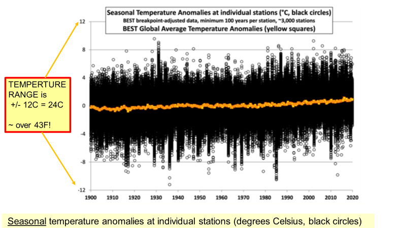
Lindzen’s plots show that there are huge seasonal and large annual departures of individual stations from the mean, quantified in Figures 1 and 2 above, which show that individual stations commonly are 10C warmer or cooler than the mean on a seasonal basis.
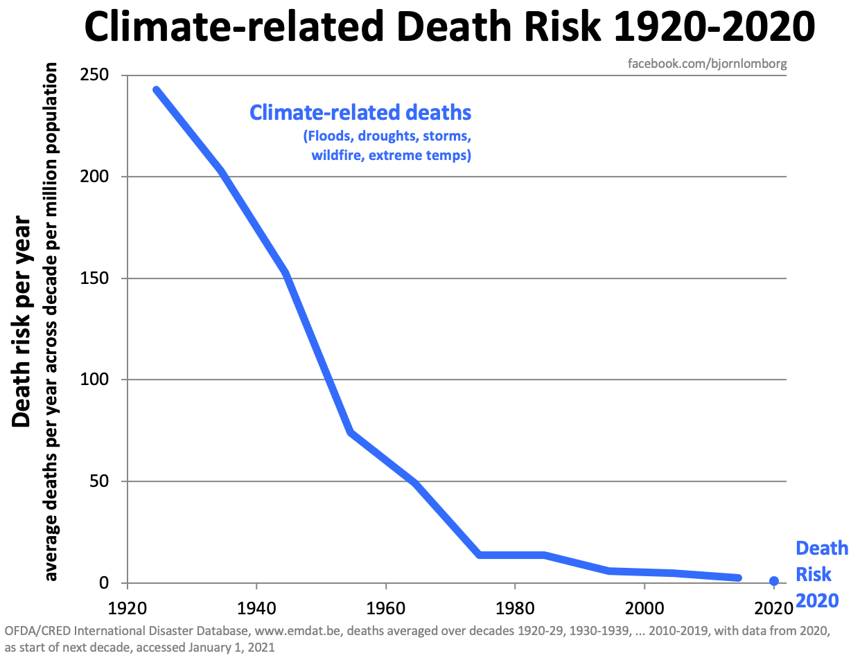
From Lindzen’s plots of the BEST data, during this period, the mean temperature anomaly: fell 1900-1915, rose 1916-1945, fell 1946-1975, rose irregularly 1976-2020, and overall has gone up about 1C. During a similar period, weather-related death rates have plunged dramatically and now approach zero.
Nonetheless, Political “Leaders,” mainstream media, Hollywood celebrities, and many in Academia proclaim a further increase of temperatures will result in an Existential Threat to humanity.
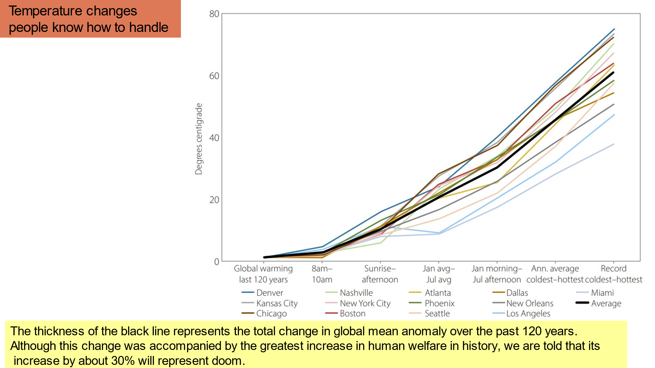
To further his assessment, Lindzen presents his graphic, “Temperature Changes People Know How to Handle,” a plot of fourteen lines, from thirteen major cities from all over the USA, and the average change in temperature from the beginning to the end of the period for the thirteen, in black. The width of that black line is ~1C over the period 1900-2020.
Starting on the left, Lindzen plots temperature changes between time periods for: 0800-1000L, sunrise to the average afternoon temperature, January to July Mean Temperature difference, January Morning Low to July Afternoon Maximum, Annual Coldest to Annual Hottest, and Record Low to Record Maximum.
These results are plotted in Figure 3 below. The 1C average increase over the 120 years, on the left of the plot, about which climate Alarmists decry so vociferously, is trivially small in comparison to the ranges of temperatures for each of the thirteen stations Lindzen plots.
In the following section, I will comment on the stability of tropical temperatures in response to the question asked by Lindzen. His point was that the temperatures in the tropics are quite stable, but why are they?
STABILITY OF TROPICAL TEMPERATURES
In Lindzen’s essay from the GWPF, “An Assessment of the Conventional Global Warming Narrative,” he asks the question,
“What produces the stability of the tropical temperature?”
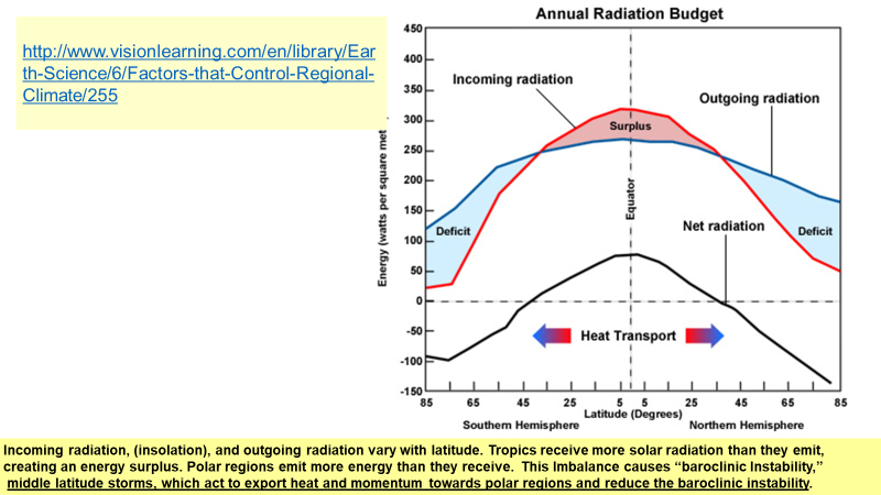
My attempt to answer uses the graphic from Slide 56 of the presentation graphics, plotting the annual radiation budget of Earth over the various latitudes of Earth’s surface, shown below as Figure 4.
Incoming radiation from the Sun is plotted as the red line and shows the surplus of energy in red shading in the low latitudes, and a deficit pole-ward of about 35 degrees latitude. Outgoing radiation is plotted as the blue line with the increasingly large deficits of energy poleward of 35 degrees, shaded in blue.
So, since the tropics’ temperatures are not changing much over time, Lindzen poses that question,
“What produces the stability of the tropical temperature?”
But what about the alleged precarious energy balance frequently referred to as the “tipping point?”
PRECARIOUS ENERGY BALANCE
Lindzen’s second post is from London’s Global Warming Policy Foundation (GWPF); he calls it,
“An Assessment of the Conventional Global Warming Narrative.”
The mention of the GWPF and my attempt to do a search for them reminded me of the topic in the below sidebar
SIDEBAR:
For a number of years, when I did a Google Search on <Robert W. Endlich> the top listing was a hit piece on me, despite the fact that I had written dozens of original works and there were posts from all over the world that individuals had shared and posted on-line. My thought then, as now, was that Google went out of its way to find hit pieces and used slanted search algorithms designed to come up with a biased search result.
For this post, I tried to find a search listing for the homepage of The Global Warming Policy Foundation in London, who had posted Lindzen’s second essay, using exactly their name, “The Global Warming Policy Foundation” precisely as within the quotes, using Google. The result was page after page of listings, some, no many, from climate alarmist organizations, yet not a single entry listed the home page of The Global Warming Policy Foundation. After several minutes of this I went back, scrolling back page after page, and counting fifty-one listings in all, with not a single one for the GWPF homepage.
“Google, the source for what they want you to read, not what you are looking to read.”
END SIDEBAR
Among Lindzen’s criticisms of the global warming narrative is the stated assumption that Earth’s energy balance is in a precarious state, and that a little more heat added to the atmosphere by added CO2 will result in a catastrophic tipping point being reached.
The catastrophism science fiction story is that more heat brings more water being evaporated, the condensation of that additional water vapor results in more heat, then even more water being evaporated, resulting in a cascade of catastrophic warming.
Lindzen characterizes this assumed positive feedback loop as “egregious., and he has been proven correct as shown in the following sidebar.
SECOND SIDEBAR
A Geophysical Research Letter studying the correlation between precipitable water (a measure of atmospheric water vapor above a point on Earth condensed into a column of liquid water) and temperatures aloft, by Wang, Wang and Pielke, showed that the feedback between the two is indeed negative, proving Lindzen’s point. Climate is indeed remarkably stable, and as Lindzen mentioned years ago, it has to be so. If it was not, temperature would have run away eons ago. A Lindzen post on this subject from 2009 is on WUWT (wattsupwiththat.com).
END SECOND SIDEBAR
Another aspect of global thermal energy stability involves the mechanisms for heat and momentum transport away from the tropics as discussed below.
HEAT AND MOMENTUM TRANSPORT AWAY FROM TROPICS
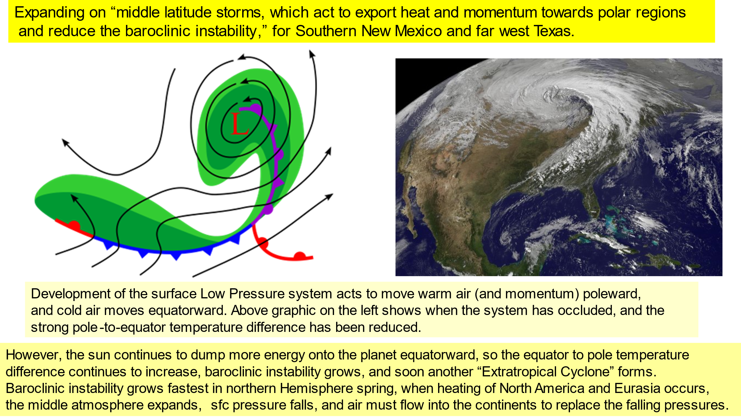
The answers to Lindzen’s question are poleward export of heat and momentum away from the tropics through ocean currents (the Gulf Stream is one example) and non-tropical or “extratropical” storm systems in the atmosphere. Sometimes we call the latter “middle latitude” storms typical of the cool and cold seasons. There is a sequence of diagrams showing development of these storms in the presentation graphics in Slides 57-62, one example of which is in Figure 5 below.
On the right, a large comma-shaped low-pressure system is seen travelling from west to east, centered in the western Great Lakes at photo time, which has reached maximum intensity and is shown transporting huge amounts of heat (and momentum) poleward, accompanied with lines of thunderstorms.
This shows that the heat is both being transported poleward from near the tropics, and vertically from the surface to great heights in the troposphere by the thunderstorms. On the left is a multi-colored diagram showing the center of the low pressure near the storm center with the red L, and lines with black arrows attempting to show the movement of winds which are the main atmospheric mechanism exporting excess heat energy from the tropics poleward. Clouds and rain (often snow, sometimes freezing rain) embedded in the low-pressure system are in green.
Another answer to Lindzen’s question,
“What produces the stability of the tropical temperature?”
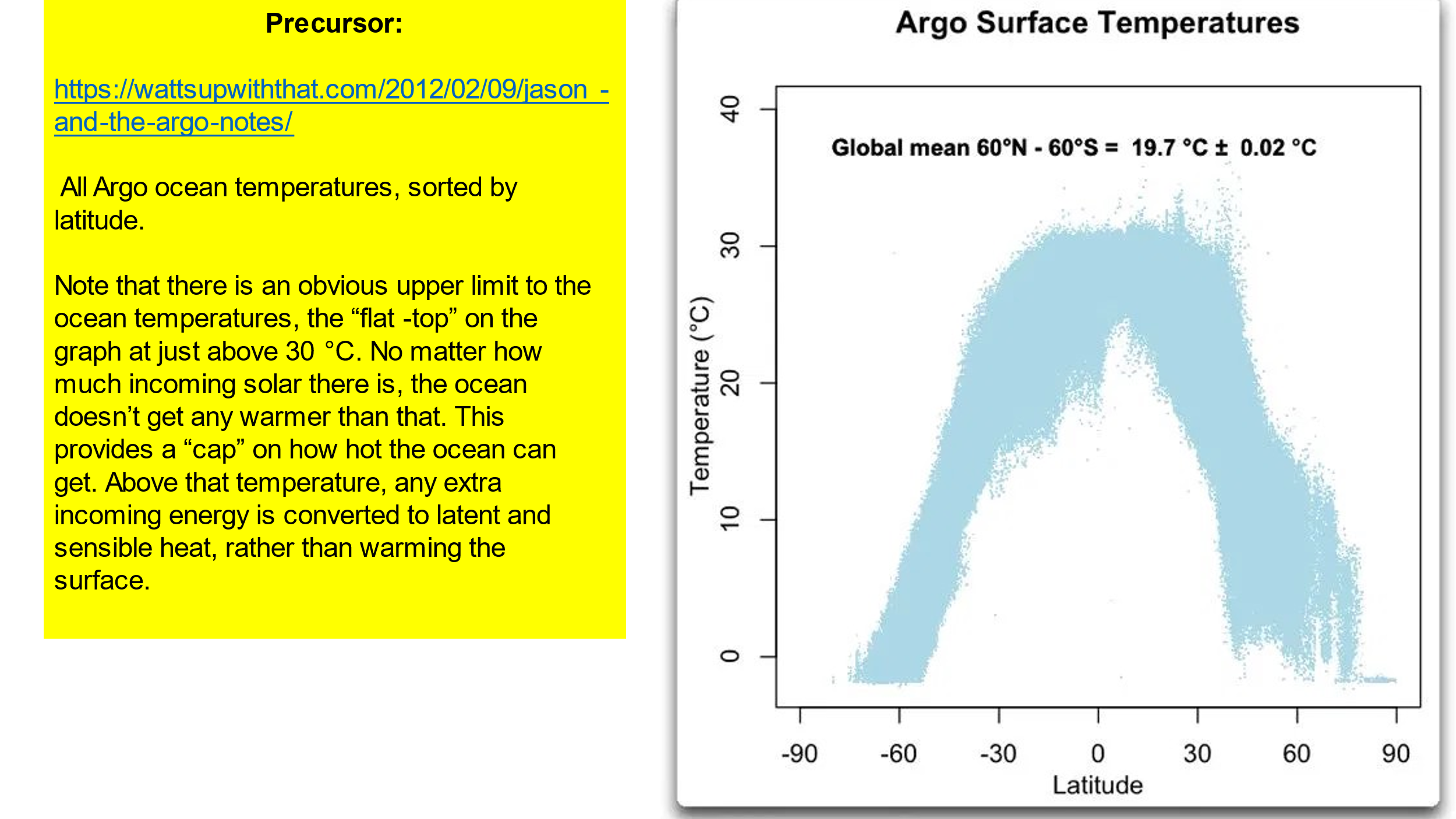
is found in a diagram showing the distribution of surface temperatures in the tropical oceans. This diagram, taken from Eschenbach’s post, plots the distribution of ocean surface temperatures measured by the Argo floats as a function of latitude. That diagram, Figure 6 below, shows there is a real maximum of ocean surface temperature very close to 30C. Even with the tropical sun shining almost overhead, once that temperature is reached, buoyant, moist convection of the tropical air occurs, tropical cumulus clouds appear, then thunderstorms form, and heat and water are transported to great heights in the tropical atmosphere, often above 50,000 feet where the temperatures can be as cold as -70C, sometimes a lot colder.
A global warming narrative as weak and lacking in factual basis as that which has been proposed requires protection, and that is where virtue signaling might come in.
VIRTUE SIGNALING
Lindzen expounds on scientific and technical illiteracy of the “educated elites,” and at one point he says,
“Elites are always searching for ways to advertise their virtue and assert the authority they believe they are entitled to.”
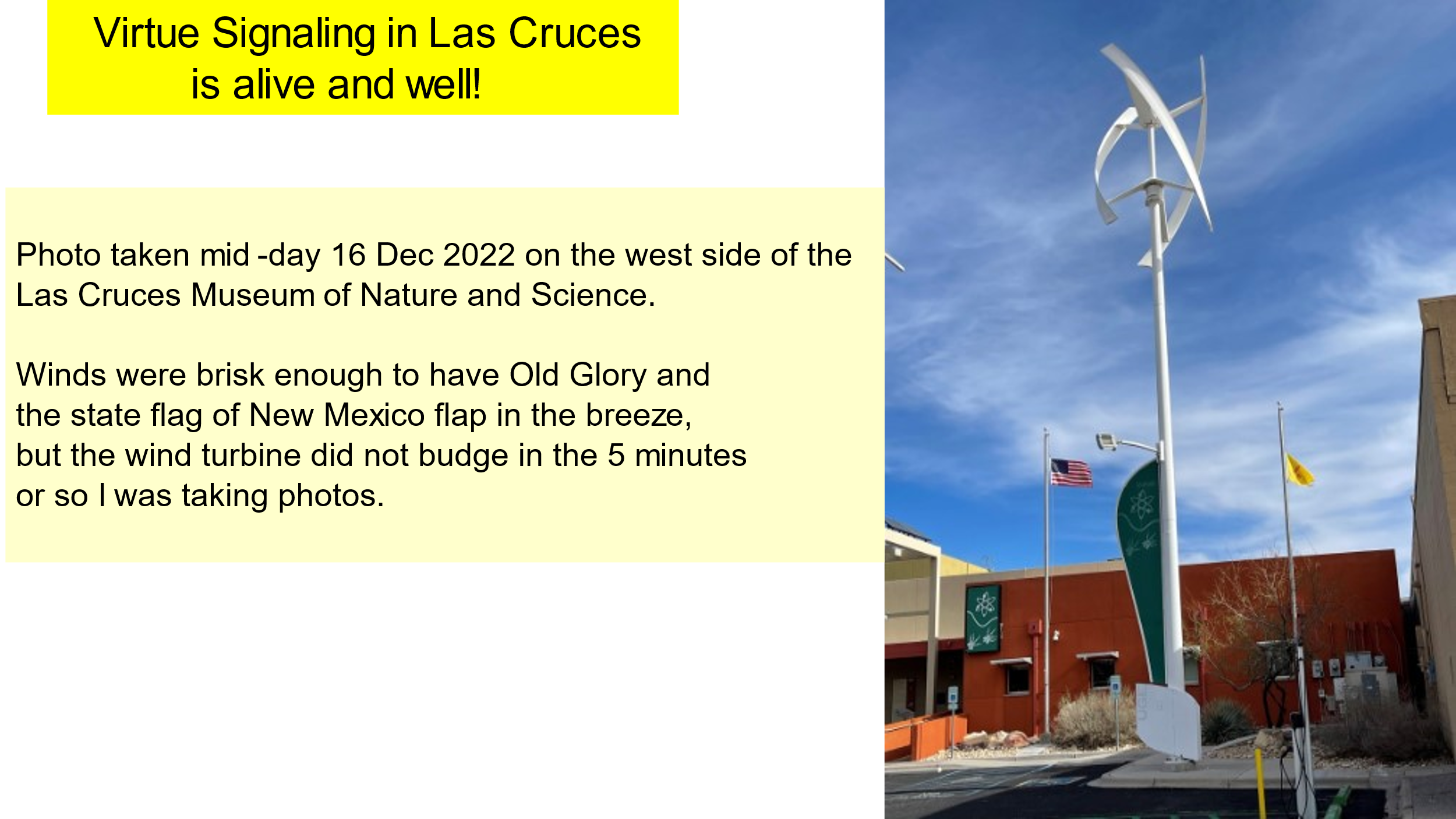
My “splendid example” of such virtue-signaling is shown in Figure 7 below, taken from Slide 22 from the presentation graphics, a photo from the downtown area of Las Cruces. A helical wind turbine sits on the west side of Las Cruces’ Museum of Nature and Science.
There were brisk enough northwesterly winds to have Old Glory and the New Mexico state flag flap briskly in the breeze, but the wind turbine did not move, meaning it had no chance to generate electricity the entire time I was setting up and taking the photo.
And now to demonize the one and only proposed cause of global warming, now morphed to “climate change,” it became necessary to declare carbon dioxide a pollutant.
CARBON DIOXIDE NOT A POLLUTANT
Lindzen says that CO₂ is a particularly ridiculous choice for a ‘pollutant’ because its primary role is as a fertilizer for plant life, which is the source of all of the carbohydrates we use to sustain ourselves.
At 417 Parts Per Million, PPM, the current value of CO₂ concentration, almost all plants are starved of CO₂. During the depths of the last Ice Age, called the Wisconsin in North America, <CO₂> dipped to between 180-220 PPM and the Juniper trees extant at that time in the Los Angeles Basin, later trapped in the La Brea Tar Pits, showed distinct carbon starvation.
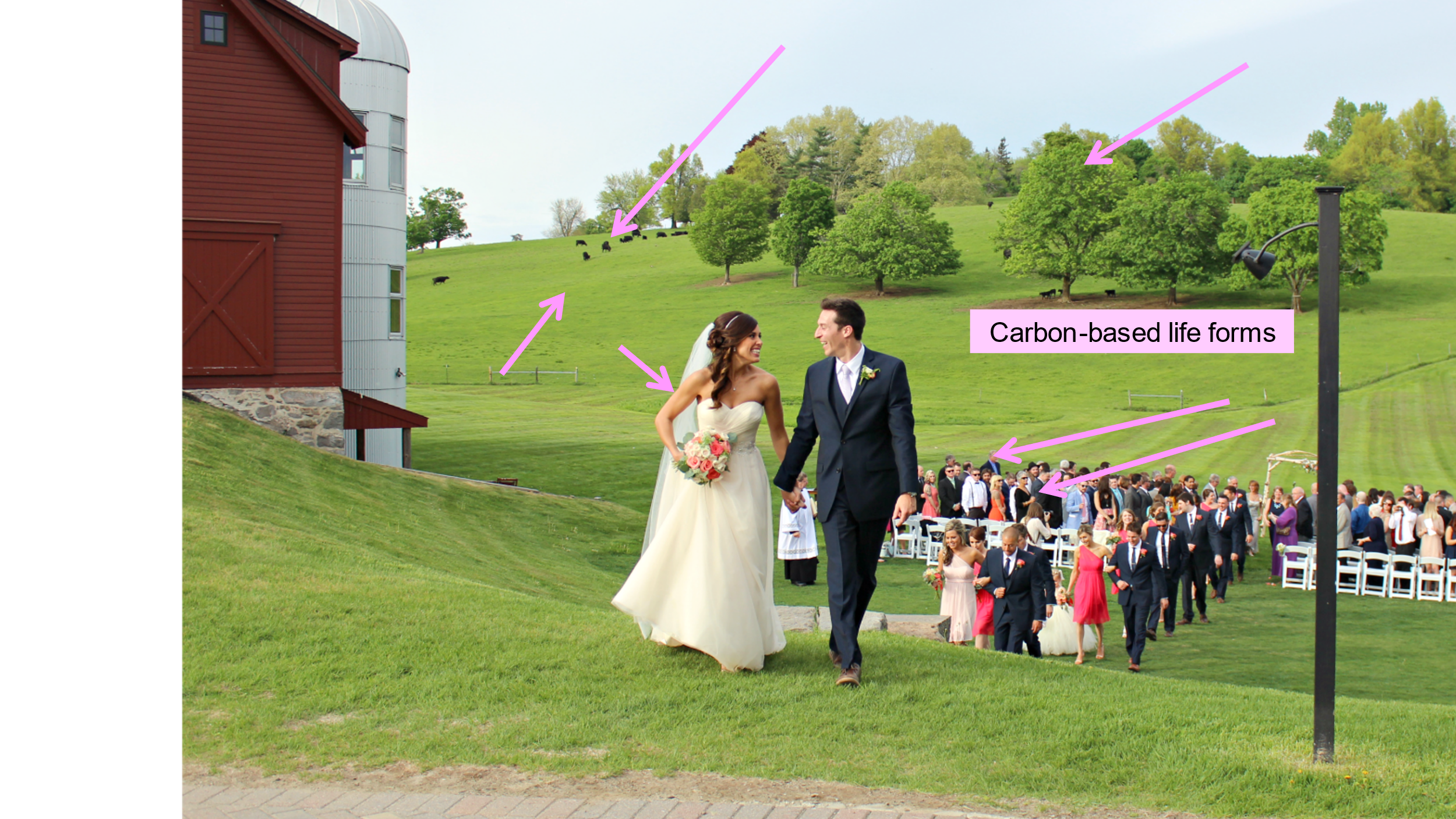
To Illustrate the point: calling CO₂ a pollutant is a serious error, the purple arrows in Figure 8 show some of the carbon-based life forms at a life celebration.
LINDZEN’S CONCLUSION
“This all leaves us with a quasi-religious movement predicated on an absurd ‘scientific’ narrative…unless we wake up to the absurdity of the motivating narrative, this is likely only to be the beginning of the disasters that will follow from the current irrational demonization of CO₂. Changing course will be far from a simple task.”
BOB’S ADDITIONAL COMMENTS
Lindzen seems reluctant to name names, but here are some especially ignorant individuals and their words showing their ignorance:
President Biden of course leads this group with his statement that a little more CO2 in the air will cause warming and an “existential threat” to humanity.
Biden’s Climate Envoy John Kerry said
“We need to get Carbon Dioxide out of the atmosphere.”
Kerry wishes us certain death from lack of carbohydrates. No thank you!
Washington Post columnist Eugene Robinson wants the Environmental Protection Agency to declare carbon dioxide a toxic substance. For being an opinion writer for the Washington Post, an overwhelmingly loud voice in Washington DC, Robinson is incredibly ignorant of the ways of Washington, because a part of the US Centers for Disease Control and Prevention determines and declares which substances are toxic. That part of CDC is the Agency for Toxic Substances and Disease Registry, ATSDR, quite the mouthful, on the internet at https://www.atsdr.cdc.gov/.
Going on-line to ATSDR’s home page there is the search bar. Put <carbon dioxide> in the search bar and there are no results returned, because CO2 is not toxic. If Robinson had even High School Chemistry knowledge of CO2, he would know that CO2 is a colorless, odorless, and tasteless gas, the fizz in soft drinks, beer, and champagne, and is easily dispersed within the atmosphere. Meteorologists might know CO2 as a trace gas well-mixed up to 109 km altitude. One would have to go to the bottom of a deep well or deep mine to be overcome by CO2. It is heavier than air and collects, unmixed, in such low spots. The unaware might be asphyxiated, with the CO2 displacing the O2 in the breathing environment, but they’d certainly not suffer toxic effects.
Such is the ignorance of Joe Biden, John Kerry, and Eugene Robinson.
Maybe there needs to be an exam required every ten years to ascertain basic High School literacy and numeracy by those who aspire to become opinion leaders or achieve elective office. These three among many others certainly show they do not understand middle school and high school science.
CONCLUSIONS
In this post we have seen from the BEST temperature records that there are huge numbers of stations having temperatures vastly different, warmer, and colder, from the mean, a considerable number of annual differences and larger number of seasonal temperature variations.
This characteristic has existed for over 3000 stations, each station having at least a 100-year long period of record and has not changed over the years Lindzen has chosen, 1900-2020. During this period, temperatures have gone up about 1C irregularly, in fits and starts, but the 1C increase is trivial in comparison with the 40C (72F), approaching 80C (144F) ranges of temperatures at thirteen stations in the Continental USA, and at the same time human deaths from weather and climate causes have plunged to well under 1% of what they were at the beginning of this period, 1900.
The several reasons for the stability of Earth’s tropical temperatures: ocean currents and “extratropical” storm systems actively act to export copious amounts of heat energy into the middle latitudes and towards polar regions.
Heating during the morning forms tropical cumulus clouds which soon build into huge thunderstorms which transport incredible amounts of heat and water substance away from the tropical surface to great heights in the tropical troposphere. There they are exported to Sun Belt latitudes in the Hadley Cell, to be further transported poleward by the middle latitude storms that frequent the temperate climate zone, especially in the cooler and cold months.
The merchants of fear from the Academy, Hollywood, Media and Government promulgate climate disaster unless we give up the inexpensive and abundant energy found in fossil fuels, and incredibly abundant in North America, but the literature, such as here, shows that the “positive feedback loop” does not, indeed cannot exist, else the climate would have run away when <CO2> was 10 or 15 times the present value, as it was in the known geologic past.
Lindzen proclaims the merchants of fear,
“a quasi-religious movement predicated on an absurd ‘scientific’ narrative,”
but he doesn’t name them. My belief is that they are totally without scientific education and critical thinking skills, led by President Biden, but assisted by Climate Envoy Kerry and writer Eugene Robinson of the Washington Post, among scores of others.