
nor do human emissions of CO2 from today’s burning of hydrocarbon fuels cause significant temperature increases.
Robert W. Endlich
Notes:
1. When a chemical compound is in brackets, e.g., “<CO2> PPM,” understand this as “atmospheric concentration of CO2 in Parts per Million.”
2. Most Time Series are plotted with increasing time left to right, but sometimes they are plotted time increasing right to left.
INTRODUCTION
There are numerous claims by many Global Warming Adherents, Alarmists, and the UN’s Intergovernmental Panel on Climate Change that burning

fossil fuels and subsequent increases of <CO2> is driving warmer temperatures because of an alleged CO2 Radiative Forcing effect. However, when compared with past Earth Temperatures, the data graphics below show that present levels of CO2 are not influencing Earth temperatures to any measurable effect, nor are human emissions of CO2 causing any significant rise in temperatures.
Most of the data quoted by the IPCC is from the period of time subsequent to “The Great Climate Shift of 1976.”
IMPORTANT DATA CLUES PRIOR TO 1976
To start, let’s consider pertinent CO2 Emissions data before 1976.
According to Oak Ridge National Laboratory and EPA, from 1946-1976, emissions of CO2 ~tripled, from ~5 GT/year (1946) to ~15 GT/ year (1976).
Yet, temperatures PLUMMETED over that time, giving the technical and popular literature numerous stories of significant cooling and even a possible coming “New Ice Age.” The Northern Hemisphere Temperature time series plots in Figure 3 of Hansen et al, “Climate Impact of Increasing Carbon Dioxide,” shows this distinctive fall in temperature.
Figure 1 below shows time series of CO2 Emissions, top, and the Hansen et al plot of northern Hemisphere temperatures, just below.
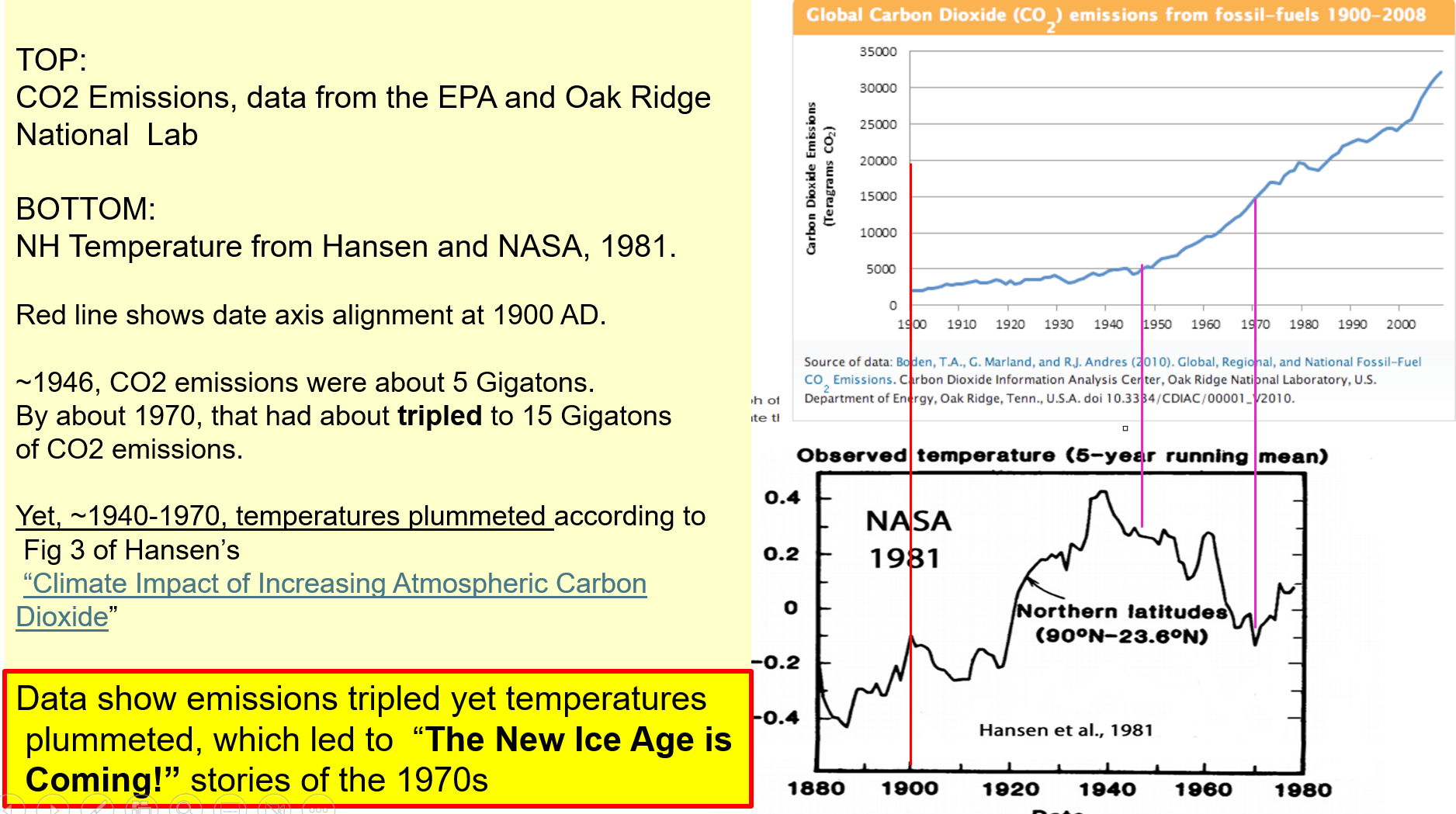
Looking at the same Figure 1, in the period 1900-1940 there was little increase in emissions of CO2, yet temperatures soared. This also presented a significant problem for the Climate Alarmists’ claims that CO2 emissions control Earth’s temperature.
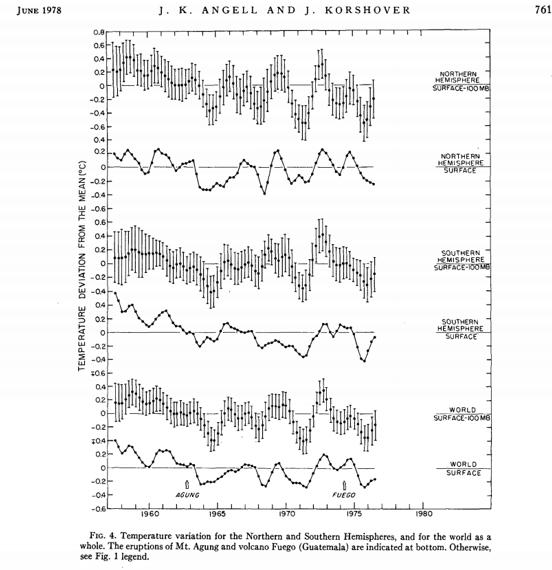
From the technical literature of the post WW2 economic boom period, in Monthly Weather Review, “Global Temperature Variation, Surface-100 mb, An Update into 1977,” by Angell, J. K. and J. Korshover, Vol. 106, No. 6, June 1978: their Figure 4 Time Series from 1955-1975 show decreasing temperatures at the Surface in the Northern Hemisphere, Southern Hemisphere, and Globally. Their same Figure 4 displays more time series over the same dates, 1955-1975, all of which show a distinct drop in temperatures at the surface, and at numerous levels aloft, to 100 mb, about 53,000 ft.
From the popular literature of the time, these print articles: Images from these print references are contained in the presentation graphics, slides 29-44.
TIME, Monday, 24 Jun 1974, “Another Ice Age?” One of the paragraph leads:
“Since the 1940s the mean global temperature has dropped about 2.7° F.”
NEWSWEEK, 28 Apr 1975, in the SCIENCE section: “The Cooling World;” an image capture is in Figure 3, below. Some quotes:
“But there is a peril more immediate than the prospect of another ice age. Even if temperature and rainfall patterns change only slightly in the near future in one or more of the three major grain-exporting countries—the U.S., Canada and Australia —global food stores would be sharply reduced.”
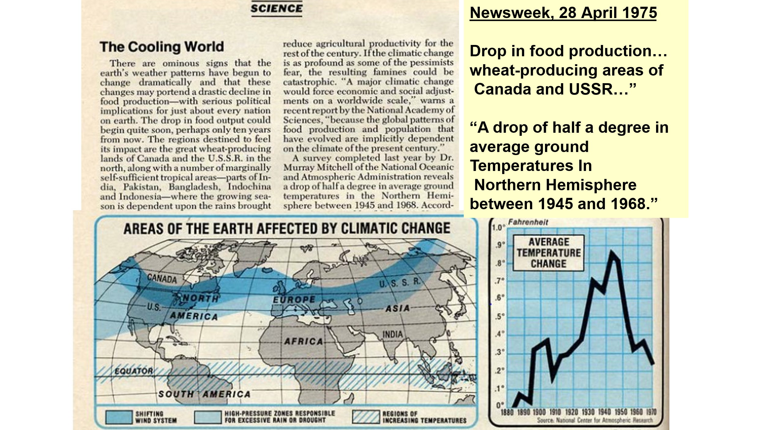
NEW YORK TIMES, Thursday, Aug 8, 1974, “Climate Changes Endanger World’s Food Output,” by Harold M. Schmeck, Jr. Accompanying the article there is a global map, with black shading covering areas of the Earth with conditions “threatening future (food) output.”
DER SPIEGEL, 12 Aug 1974, “Catastrophe in Installments,” Leading paragraph in bold:
“Is a new ice age coming? Not right away, but the rainy summer in Northern Europe, climate researchers fear, was only part of a worldwide change in weather – a preview of cooler and wetter times to come.” <Translated by my daughter, High School German teacher, Cathy Gamble>
SCIENCE NEWS, 1 March 1975, “THE ICE AGE COMETH?” Cover art featured a glacier pushing from Mid-Town south to lower Manhattan.
TIME, 31 Jan 1977, article title on the cover, “The Big Freeze,” cover shows photo of a man in a red knit hat covering all of his head except nose and eyes, snow on the knit hat over his head and throat.
TIME Cover from 1979, date obscured, Couple huddled in front of Christmas Tree and next to radiator, “The Cooling of America 1979,” on page fold in green: story title, “A Challenge to Khomeini.”
TV short, from the “In Search of” TV series, “In Search of The Coming Ice Age,” https://www.youtube.com/watch?v=1kGB5MMIAVA
ICE CORES REVEAL IMPORTANT MEASUREMENT PATTERNS
There is a second data set showing presumptions that CO2 emissions and concentrations control Earth temperatures are fundamentally wrong.
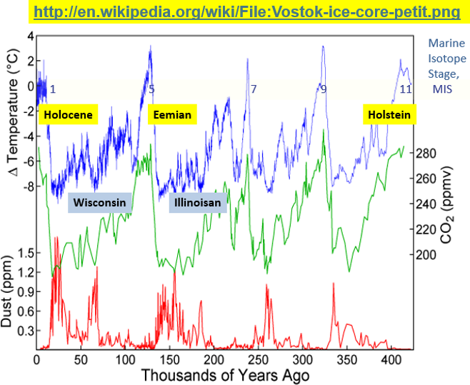
That second data set is from the Vostok Ice Cores in Antarctica, excerpted and plotted in Figure 3, below.
In this data plot, variations from present Temperature are plotted in blue, ‘Greek “Delta” Temperature,’ while <CO2> is plotted in green, scale of concentrations on the right.
There are five interglacial periods in this plot, peaks in the temperature time series, each numbered as a Marine Isotope Stage, or MIS, mentioned briefly below, and plotted left to right.
(The original definition of Marine Isotope Stages comes from Lisiecki, L.E, and M.E. Raymo in “A Pliocene-Pleistocene stack of 57 globally distributed benthic Delta18 O records,” PALEOCEANOGRAPHY, VOL. 20, PA1003, 2005.)
On the left, plotted in blue, are temperature changes in the current interglacial, MIS 1, the past 10,000 or so years, frequently called the Holocene. Today <CO2> is now over 425 Parts per Million, PPM, accessed from https://www.co2.earth/ on 19 Aug 2025. Today’s <CO2> 425 PPM would be off scale high, but today’s temperatures are at the Zero mark in Figure 3.
Next peak in temperature to the right is the interglacial MIS 5, about 140,000 years ago, the Eemian, distinctly warmer than the present, but with <CO2> only 270 PPM,
Next is the interglacial MIS7, about 240,000 years ago, distinctly warmer than the present <CO2> briefly 280 PM,
Next is the interglacial MIS 9, about 340,000 years ago, distinctly warmer than the present, <CO2> 290 PPM,
Last, furthest right, MIS 11, about 410,000 years ago, with a mean temperature warmer than the Holocene and <CO2> 280 PPM.
At this point the reader should ask the question: “How, at present, with <CO2> 425 PPM, off scale high on Figure 4, could the present temperatures be 2.5C COLDER than the Eemian, 140,000 years ago, MIS 5, which had <CO2> 270 PPM?”
There is only one answer: <CO2> clearly does not control temperature.
CLOSE-UP VIEW OF TEMPERATURE HISTORY
Below, in the close-up plot, are the Holocene temperatures from the Vostok Ice Cores, for the past 10,000 years.
(Note carefully, the present time is on the right in Figure 5 below.) Source:
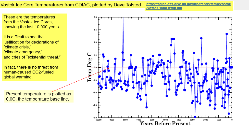
The present temperature is labeled as 0.0, and a baseline is drawn in red; the blue temperature plot shows several temperature changes of +/- 1.5C. There are also temperature excursions of +/- 2C. A rhetorical question to be asked is,
“How can the Climate Alarmists be so certain that THIS LATEST temperature fluctuation is a CATASTROPHIC ONE?”
Just looking at the chart, the question answers itself. There is nothing unusual about the present temperature or rate of change of temperature. There are no temperature changes which could be deemed “unusual,” or “catastrophic.” The climate alarmists are clearly wrong.
Notice here the temperature trace never flat-lines. Temperature change, or “climate change” is always happening. The “never in stasis” characteristic is visible in all temperature time series. Temperature changes of +/- 1.5C are a typical range which has occurred numerous times in the past 10,000 years.
Please note again, referring to Figure 4, that the present interglacial is by far the COLDEST of the five interglacials displayed in the last 410,000 years, despite the present <CO2>being off-scale high, over 425 PPM.
Another rhetorical question:
“How could CO2 emissions and <CO2>, now (August, 2025) 425 PPM, be a problem for US residents and the climate when the present temperature is not even close to being the warmest of the present interglacial?”
Figure 5 above shows the maximum temperature of the present interglacial occurred some 8,000 years ago, some 2C warmer than at present.
Again, Ice Core reconstructions of temperature from the Vostok Ice Cores show numerous fluctuations of +/- 1.5C; there are no reasons to think the present increase in temperature from the depth of the Little Ice Age two centuries ago is in any way leading to the climate catastrophe proclaimed by the climate alarmist community.
From New Astronomy, consider the 1 Aug 2016 journal article by Yndestad, Harald, and J.E. Solheim. Their plot of Total Solar Irradiance, TSI, 1700-2023, is just below.
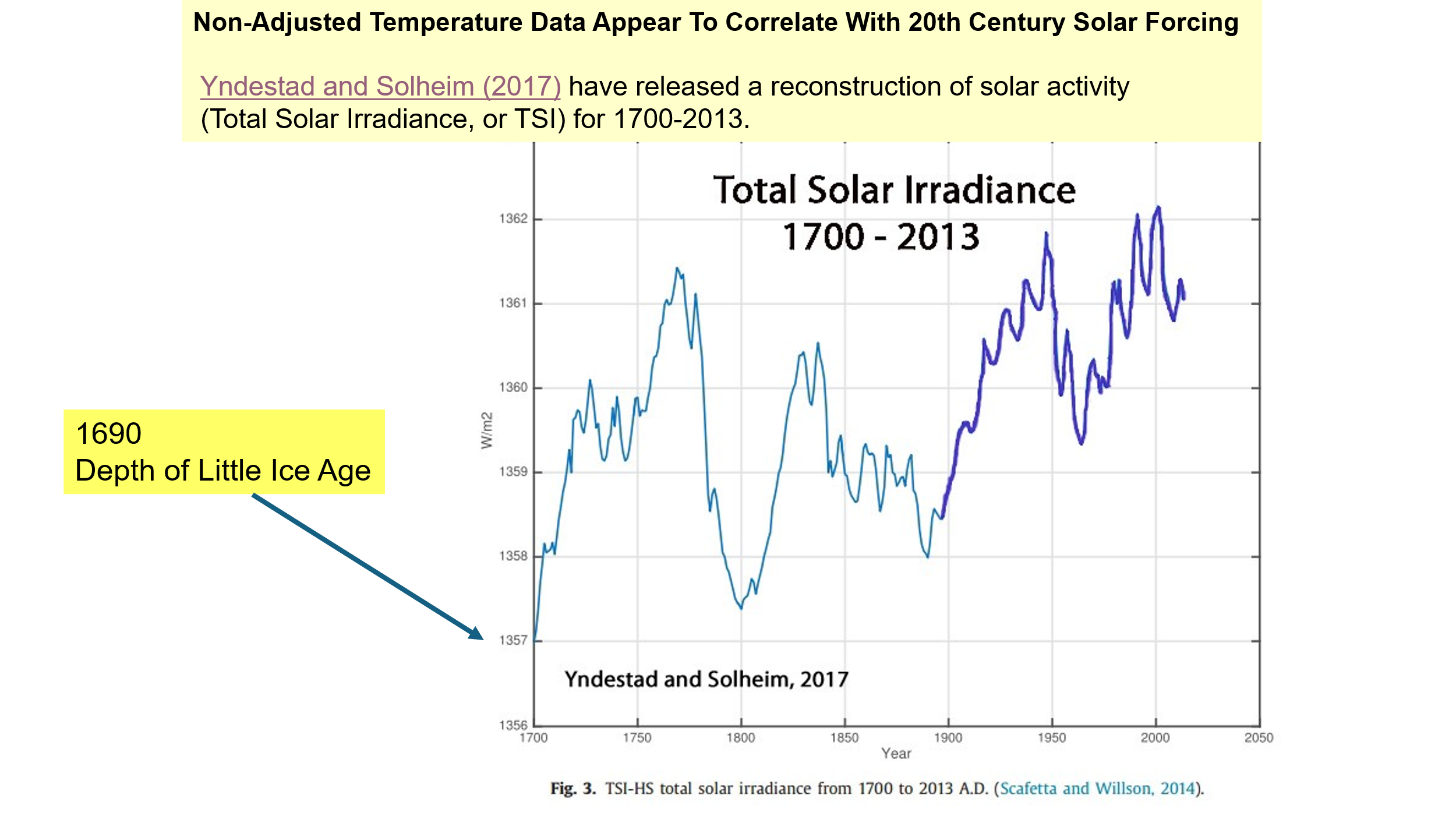
There appear to be major swings of TSI, perhaps every 60 years, and the TSI reconstruction shows frequent minor changes in the direction of the TSI trace, seemingly annually.
A close-up of the period 1845-2013 is in Soon, W. in Figure 7, below, showing TSI in Black, and the Berkeley Earth Surface Temperatures in Gray. The message from the data clearly is, “Earth Temperature changes are caused by changes in Total Solar Irradiance, TSI.”
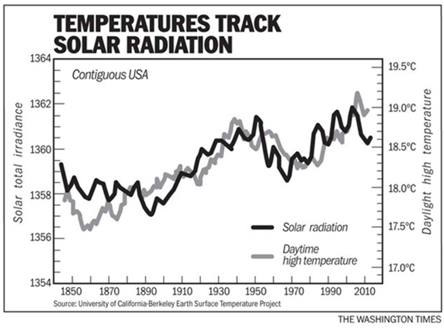
The data plotted in Figure 7 are significant; they show prominently the dramatic drop in temperature from 1940-1976, in Gray, accompanied by a significant drop in TSI from 1950-1970, in Black. During this time, CO2 emissions tripled.
Readers and scientists alike must take from these data that during the post-WW2 economic boom, from the mid-1940s to the mid-1970s, despite the tripling of CO2 emissions, temperatures fell as TSI fell. This means that CO2 emissions did not control temperatures, rather, TSI controlled temperatures.
High School and College students of Chemistry should learn Henry’s Law, named for William Henry, British chemist. Loosely, where temperatures and pressures in the water and air are those commonly found at Earth’s surface,
“The amount of dissolved gas in a liquid is directly proportional at equilibrium to its partial pressure in the atmosphere above the liquid.”
Worthwhile information on this topic is on our web site.
Several publications demonstrate that as sea water warms, FIRST the sea water temperature increases, THEN the atmospheric <CO2> increases. This is seen In Humlum, et al, “The phase relation between atmospheric carbon dioxide and global temperature.” Figure 8, below, shows this feature, where time progresses from left to right. Note Well: FIRST the sea water temperature (blue), increases, THEN the atmospheric <CO2> (green) increases. Clearly TEMPERATURE controls <CO2>. Not the reverse.
Another pertinent diagram, from Carbon Sense, is repeated as Figure 9 below.
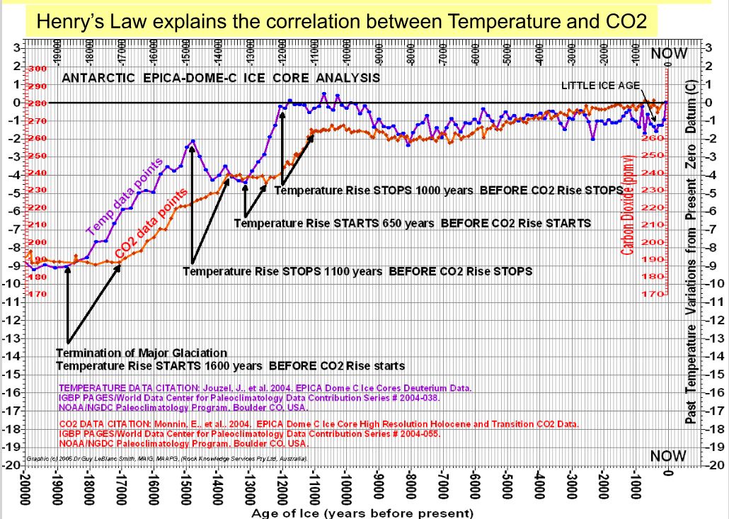
This diagram in Figure 9 shows an EPICA Dome C Ice core analysis from Antarctica, originally from The Carbon Sense Coalition. This Carbon Sense graphic plots blue dots, the time series of temperatures, and red dots, the time series of CO2 from that ice core. Time advances from left to right. From the left, FIRST the temperature changes, THEN, later, the CO2 changes. There are four separate demonstrations plotted, showing that TEMPERATURE controls <CO2>, not the reverse.
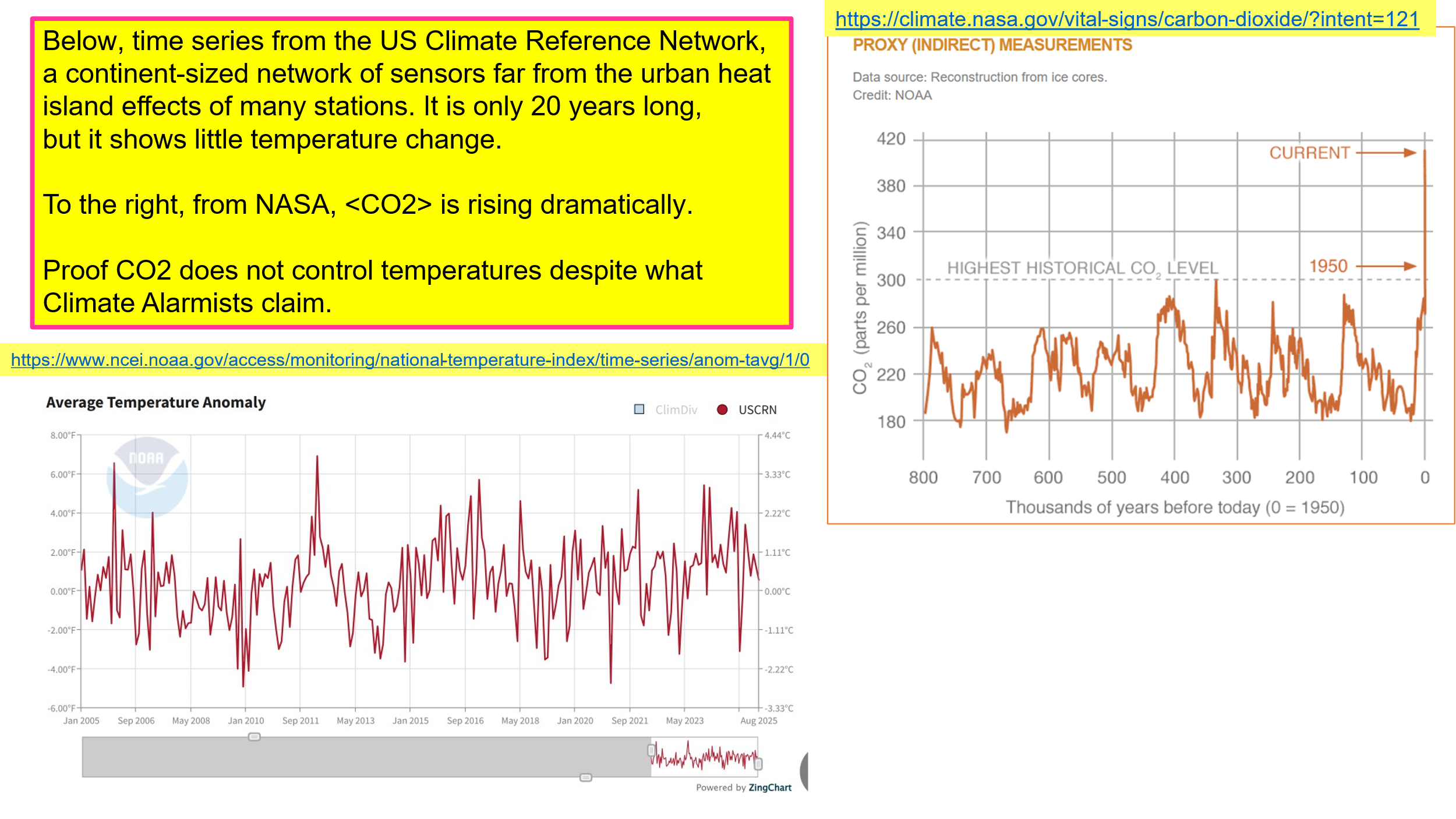
Below is Figure 10, showing on the left a plot of surface temperatures from NOAA, the United States Climate Reference Network, USCRN, for the 20-year period 2005-2025. On the right is a time series of Carbon Dioxide Concentrations from NASA, showing a dramatic increase in <CO2> over the past 100-200 years. The dramatic increases in CO2 have not influenced the surface temperatures recorded from the USCRN.
CONCLUSIONS
This paper shows that before the Great Climate Shift of 1976, as emissions and concentrations of CO2 increased, Earth’s temperatures fell. The cooling climate was in the news and on TV “In Search of… The Coming Ice Age.”
We showed here that increased TSI caused temperatures to increase after the Great Climate Shift of 1976.
Higher concentrations of atmospheric CO2 clearly do NOT cause increasing temperatures, otherwise, at today’s (August, 2025) <CO2> of 425 PPM, this would be the warmest interglacial of the past 410,000 years. Instead, at <CO2> of 425 PPM, off scale high in Figure 4 above, we see the Holocene Temperatures are the COLDEST of the five interglacials which occurred in the past 410,000 years.